Most photographers worry about what to include in their photos. Mastering negative space means learning when what you exclude matters more.
Negative space is the empty area around your subject: the sky, a plain wall, calm water, any region without visual information. And far from being wasted space, it's one of the most powerful composition tools available.
Used well, negative space amplifies your subject, creates breathing room, and gives images a graphic, impactful quality. Used poorly, it just looks like you stood too far away.
The difference comes down to intention, and it's one of the most nuanced topics in our composition guide.
What Negative Space Actually Does
Negative space works through contrast. When your subject is the only visual element in a sea of emptiness, it becomes impossible to miss.
In a crowded room, you might overlook someone, but alone in an empty field, they command complete attention.
But negative space does more than emphasize subjects:
Creates breathing room: Cluttered photos feel claustrophobic. Negative space gives viewers' eyes somewhere to rest, making the visual experience more comfortable.
Suggests emotion: Emptiness around a subject can convey loneliness, freedom, insignificance, calm, or contemplation depending on context.
Adds graphic impact: Images with bold negative space often work well as prints, designs, or anywhere strong visual simplicity matters.
Directs attention: With only one thing to look at, the viewer has no choice but to look at it.
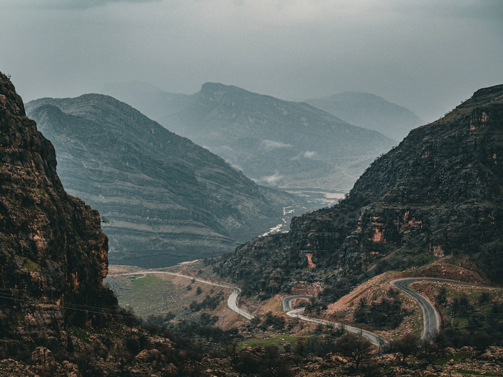
Creates scale: A tiny subject in vast negative space communicates its smallness relative to the world, a technique that transforms landscape photography.
When Negative Space Works
Not every photo benefits from negative space. It's powerful in specific situations:
When Your Subject is Visually Strong
Negative space amplifies what's there. If your subject is interesting, distinctive, or visually compelling, surrounding it with emptiness makes it more so.
A striking silhouette, a colorful object against a plain background, a person with an expressive gesture: these subjects can carry the weight of a mostly empty frame.
Weak subjects, by contrast, just look lost.
When Mood Matters More Than Information
Negative space sacrifices visual information for emotional impact. You're showing less of the world to evoke more of a feeling.
Loneliness, tranquility, contemplation, and vulnerability often benefit from negative space, while energy, excitement, abundance, and chaos typically don't.
When Simplicity Serves the Image
Some subjects work best presented simply. In portraits, product photography, and minimalist compositions, negative space strips away distraction and lets the subject speak clearly.
When Creating Visual Tension
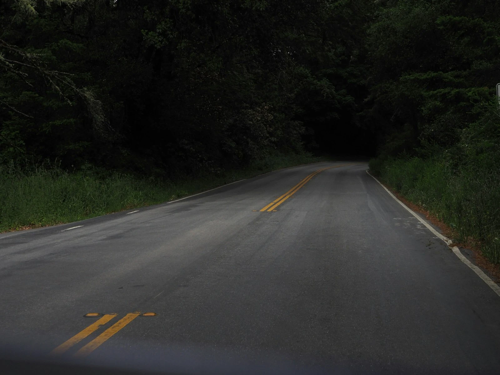
Strategic negative space placement creates tension. A subject at the extreme edge of the frame, surrounded by emptiness on one side, creates unease or anticipation that centered compositions lack.
When Showing Scale
A person small against a vast landscape. A boat tiny on an enormous sea. Negative space creates scale relationships that contextual clutter would obscure.
When Negative Space Fails
Empty space without purpose just looks empty, and there are several situations where negative space works against you.
When the Emptiness Isn't Clean
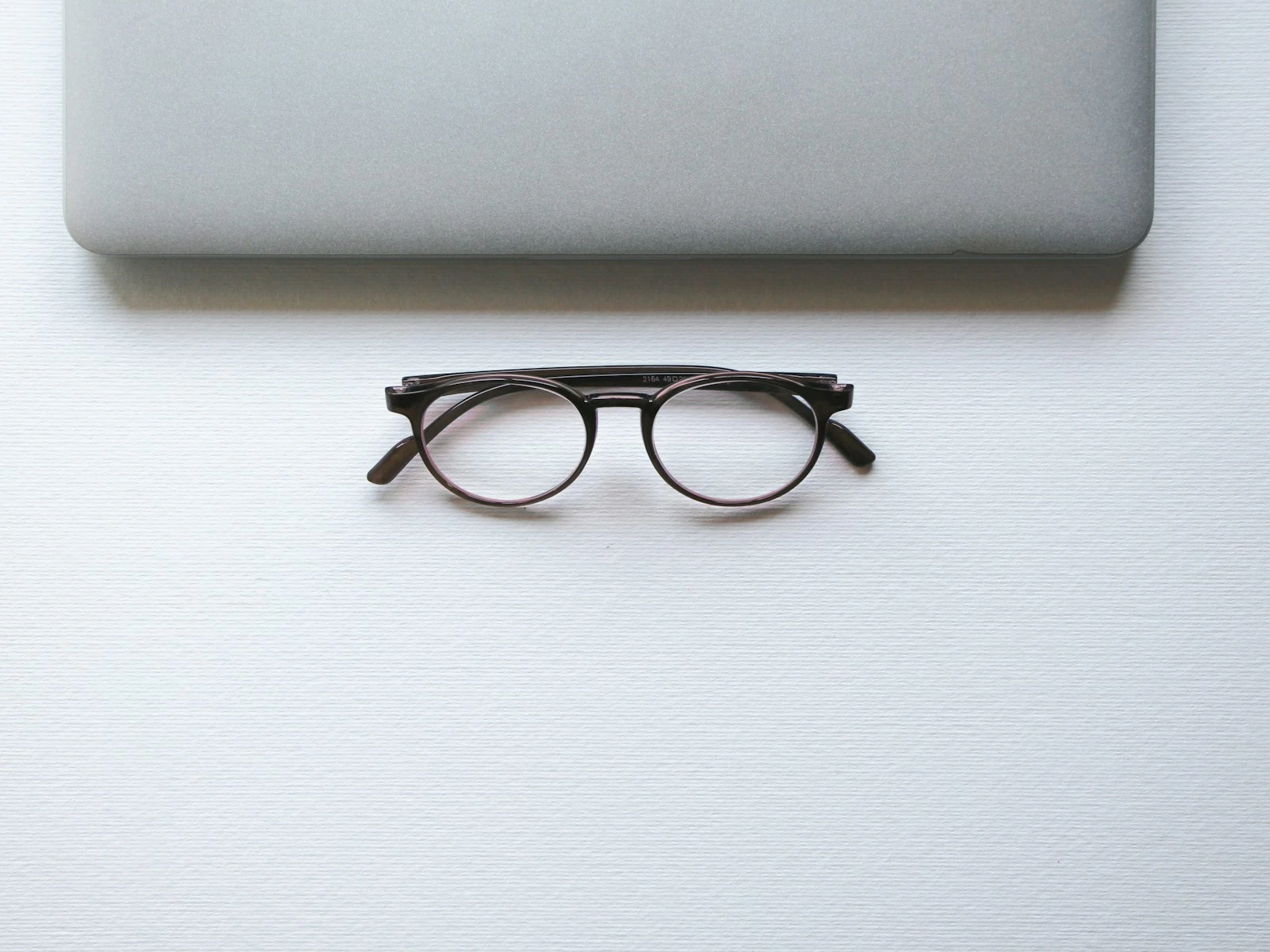
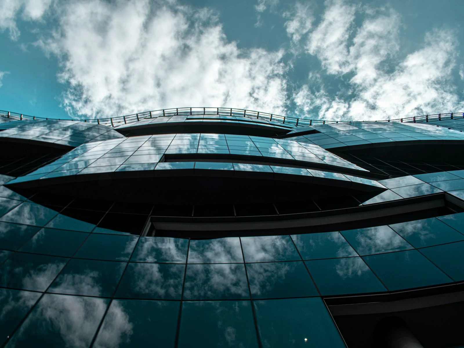
Negative space needs to be truly negative, free of distracting elements. A "plain" sky with scattered clouds, a "simple" wall with visible texture and blemishes, and a "calm" surface with debris aren't clean negative space. They're low-information clutter.
For negative space to work, it needs to recede visually so your subject can advance.
When the Subject Can't Carry It
Negative space puts pressure on your subject. Everything else is empty; this one thing has to be worth the viewer's attention.
A weak subject, one that is visually bland, poorly lit, or unclear in purpose, gets exposed by negative space rather than elevated by it, because there's nothing else to look at and what's there isn't interesting.
When Context Matters
Sometimes the environment around a subject is the story. An environmental portrait that reveals someone's workspace, a travel photo that establishes a location, and a documentary image that shows relationships all need positive space to communicate.
Negative space in these situations strips away the meaning.
When It's Accidental
Intentional negative space feels designed, while accidental negative space, where you just stood too far away or forgot to consider the edges, feels like a mistake.
Intentional negative space usually places subjects deliberately, often at thirds intersections or edges, while accidental negative space often features awkwardly centered subjects floating in space without clear purpose.
Creating Clean Negative Space
Finding truly clean negative space requires attention:
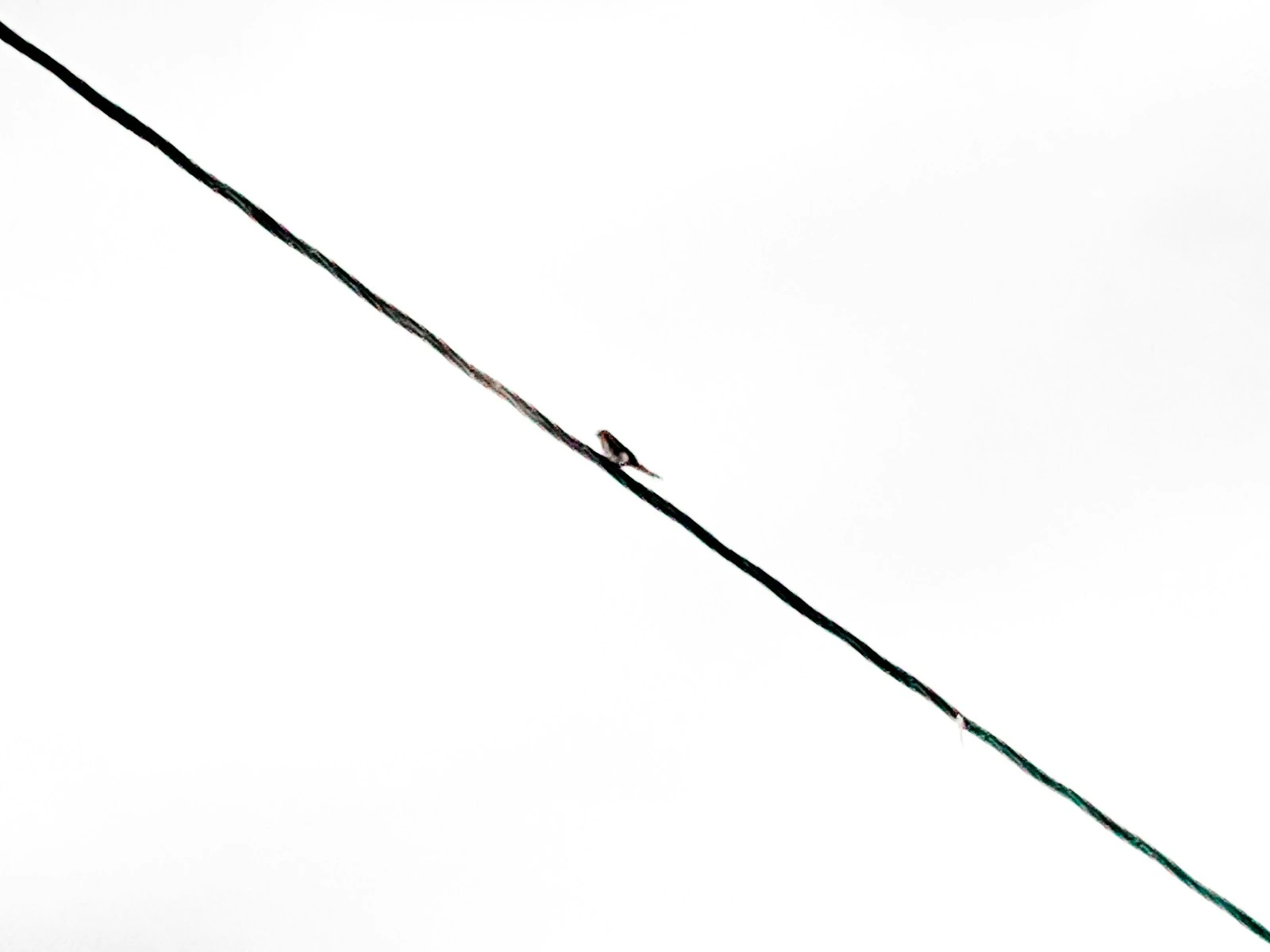
Sky
Open sky is the most common negative space, but it's rarely as clean as it looks. Scan for:
- Scattered clouds that create visual texture
- Birds or planes
- Electrical wires
- Gradients that might feel uneven
Clear sky at certain times, such as just after sunset, often provides the cleanest option. A golden hour timing can help you plan the timing.
Walls and Surfaces
Man-made surfaces offer controlled negative space, but watch for:
- Visible texture that competes with the subject
- Marks, stains, or imperfections
- Shadows falling across the surface
- Color variations
Solid, matte surfaces in even light work best.
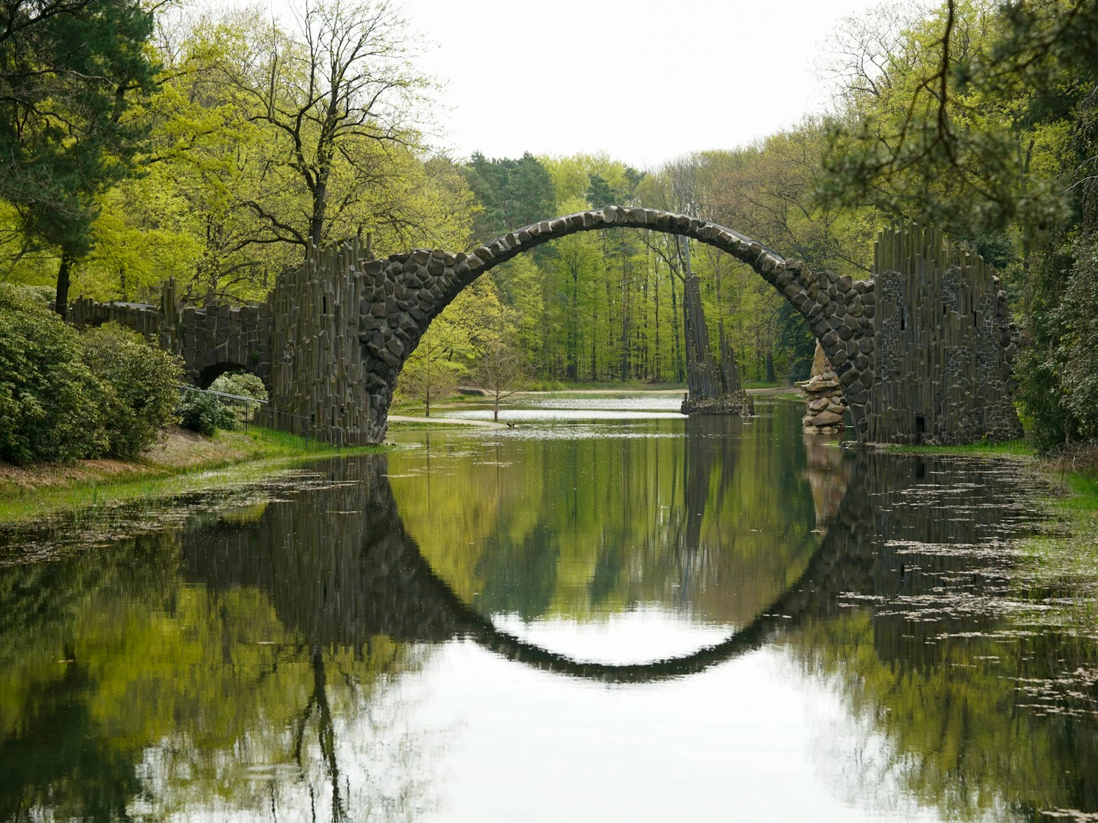
Water
Calm water creates beautiful negative space, but it's rarely still enough, so long exposures can smooth water into clean, featureless areas when natural calm isn't available.
Out-of-Focus Areas
A wide aperture can transform a busy background into soft, undistracting negative space. The blur removes detail, leaving color and tone without visual noise.
This creates negative space that's technically "full" of stuff but functions as emptiness because nothing is sharp enough to draw attention.
Post-Processing
Dodging and burning, desaturation, or careful vignetting can push areas toward visual emptiness. These aren't as clean as capturing true negative space, but they're sometimes a practical solution.
Placing Subjects in Negative Space
Where your subject sits within negative space changes the effect:
Edge Placement
Subjects at the edge of the frame with negative space stretching away create tension and dynamism. The emptiness suggests continuation, space the subject might move into or has moved away from.
This works well for implying movement or narrative.
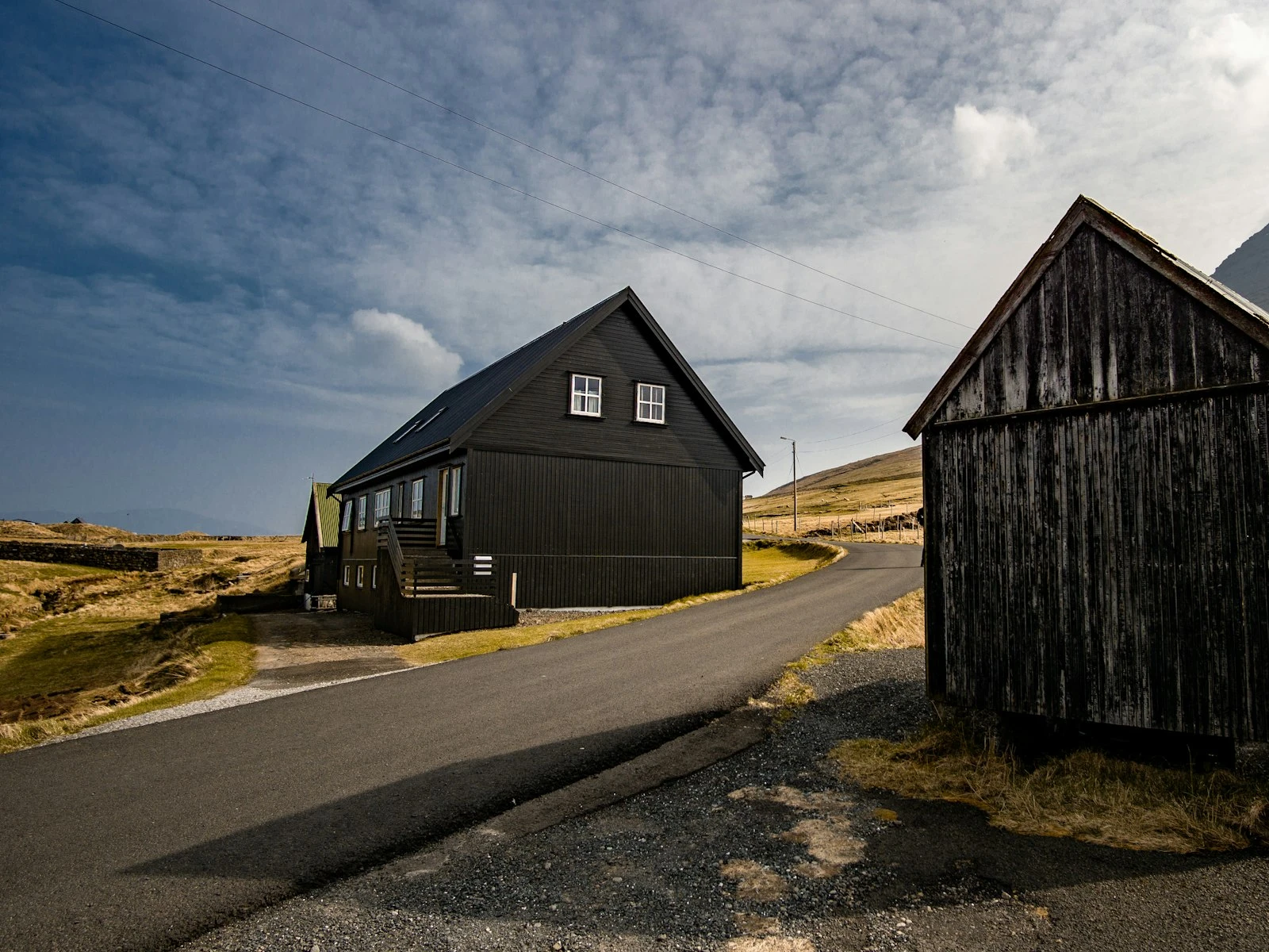
Centered Placement
Subjects centered in negative space feel stable, balanced, and presented rather than caught in motion. The symmetry of surrounding emptiness creates calm formality.
This works well for portraits, products, and subjects you want to present directly.
Bottom-Heavy
Subject low in the frame with negative space above suggests aspiration, smallness, or vulnerability. The weight of emptiness presses down.
Top-Heavy
Subject high with negative space below feels lighter, more grounded in its position. Less common but useful for specific effects.
Negative Space Ratios
There's no formula for how much negative space to use, but consider these ranges.
Moderate negative space (50-70% of frame): Creates emphasis without overwhelming. Good starting point for most applications.
Dominant negative space (70-90% of frame): Creates strong graphic impact but requires a visually powerful subject. Works for minimalism, scale relationships, emotional intensity.
Extreme negative space (90%+ of frame): Very bold. The subject becomes almost incidental, a punctuation mark in emptiness. Powerful when it works, confusing when it doesn't.
The right ratio depends on your subject's visual strength and the mood you want. More negative space requires a stronger subject to balance it.
Practice: Deliberate Emptiness
Find a simple subject and photograph it with progressively more negative space:
- Fill the frame normally
- Give the subject room to breathe (30-40% negative space)
- Make the subject small in dominant emptiness (70% negative space)
- Push to extreme: tiny subject in vast emptiness (90% negative space)
Notice how the feeling changes. Notice where the subject stops commanding attention and starts looking lost. That threshold is different for every subject and helps you calibrate how much negative space this particular image can support.
Key Takeaways
- Negative space works when your subject is visually strong enough to carry a mostly empty frame; weak subjects just look lost in emptiness.
- Use truly clean negative space free of distracting details, since scattered clouds, textured walls, or surface debris undermine the effect.
- Place subjects deliberately at edges for tension and implied movement, or center them for stability and direct confrontation.
- Start with 50-70% negative space for emphasis without overwhelming, and push to 70-90% only when the subject is visually powerful enough to anchor the composition.
More in This Guide
Continue exploring composition techniques.