I'm going to tell you something that most composition tutorials won't. The rule of thirds is the most overused, least understood piece of photography advice in existence.
It's genuinely useful, so it's not that the rule is wrong. But the way it's taught, as a rule to always follow, creates photographers who compose on autopilot and wonder why their images feel formulaic.
What I wish someone had told me years ago is that the rule of thirds is a decision, not a default. Centering is also a decision. The real question is always "did I put my subject in the right place for this specific image?"
This guide will help you make that decision deliberately. It's one of the most important topics in our full composition guide. And if composition terms like negative space, leading lines, or visual weight are new territory, our photography glossary defines all of them.
What the Rule of Thirds Actually Does
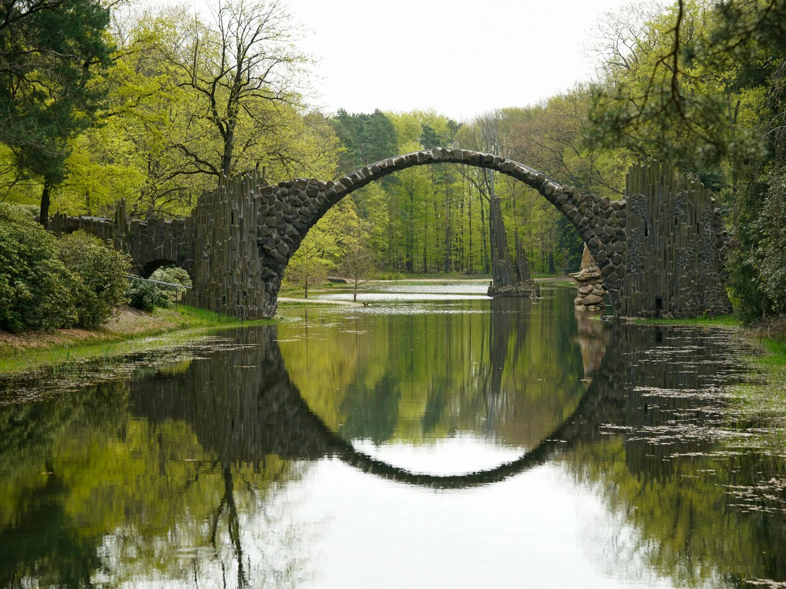
The rule of thirds divides your frame into nine equal parts using two horizontal and two vertical lines. The four points where these lines intersect are supposed to be "power points," places where subjects naturally draw attention.
Those intersections do create visual interest because they introduce tension. A subject at a thirds intersection exists in relationship to the space around it. The eye has somewhere to travel. The composition feels dynamic rather than static.
But the standard explanation misses the fact that tension isn't always what your image needs.
Sometimes you want confrontation, not relationship. Sometimes you want stability, not dynamism. Sometimes the most powerful choice is the one the "rule" tells you to avoid.
When Thirds Works Best
The rule of thirds excels in specific situations, and understanding these helps you recognize when to use it and when to consider alternatives.
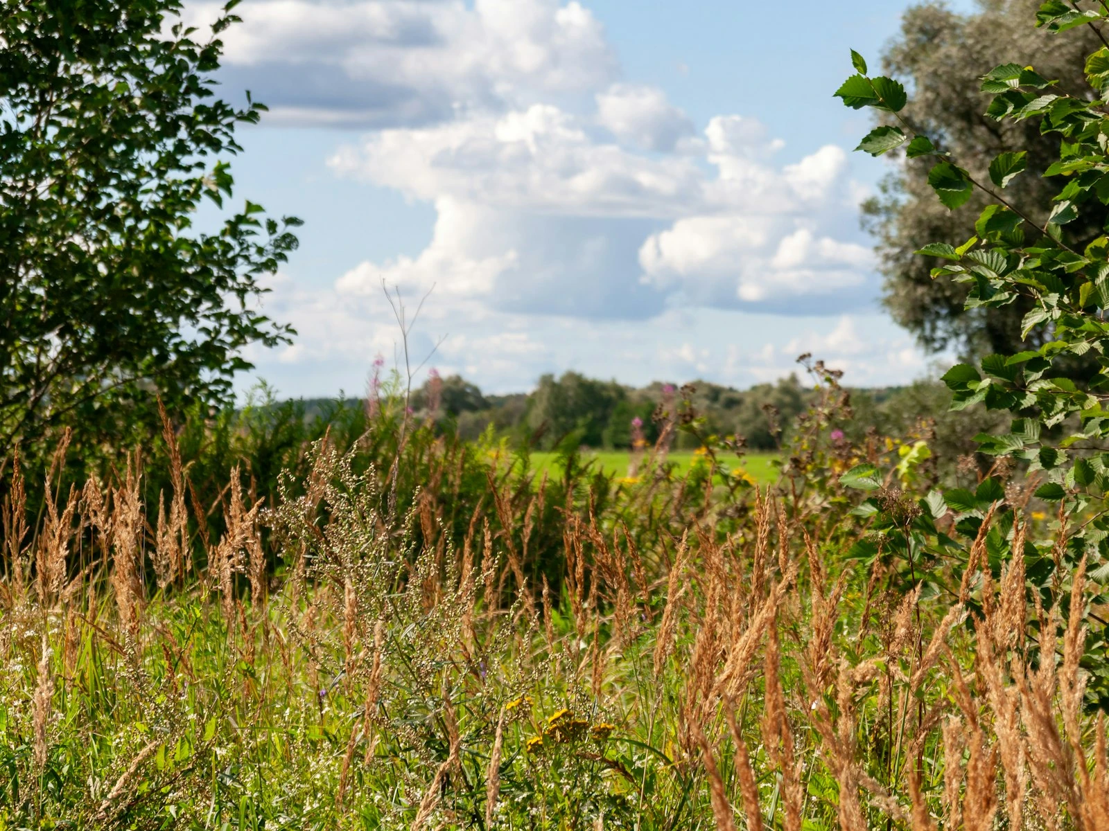
When your subject interacts with its environment: A person walking toward something. A boat on a lake. A tree in a field. When the relationship between subject and surroundings matters, thirds placement gives both elements room to breathe and interact.
When you want to imply movement or direction: Subjects placed on thirds intersections create visual momentum. There's somewhere for them to move into (or out of). The empty space becomes meaningful, functioning as negative space that adds weight to the composition.
When storytelling matters more than impact: Editorial photos, documentary work, environmental portraits: any time you want viewers to absorb context rather than focus solely on the subject.
When multiple elements need balance: If you have two important subjects, placing them on opposite thirds intersections creates intentional balance without fighting for dominance.
When you want a "natural" feeling: Thirds placement tends to feel casual, observed, and uncontrived. It's less confrontational than centering, which can help when you want viewers to feel like they discovered the image rather than having it presented to them.
When Centering Wins
This is where I diverge from standard advice. I think centering is underrated, and I use it more than many photographers would consider "correct."
Centering works when you want:
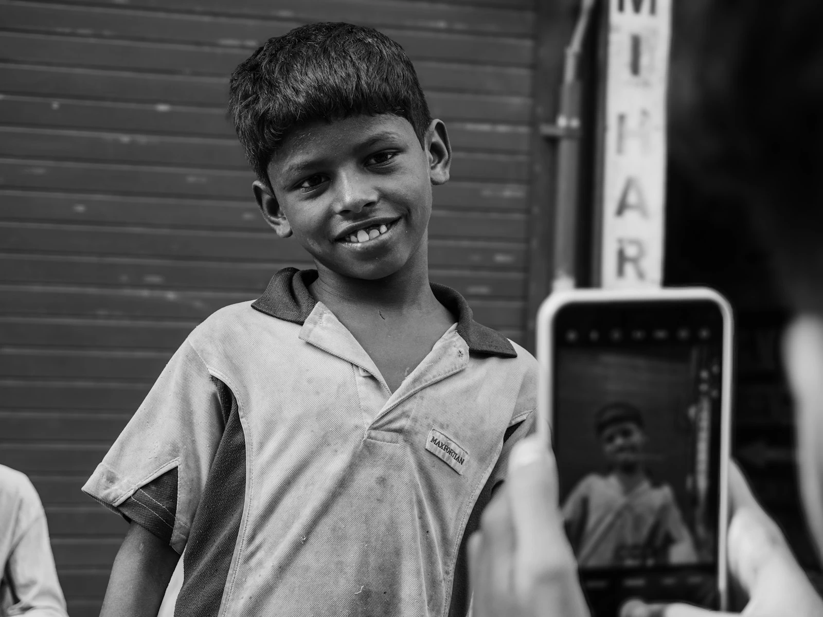
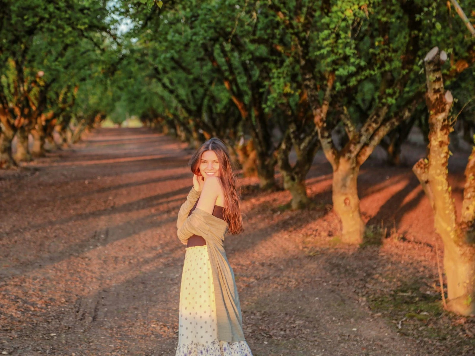
Direct confrontation: A centered subject looks at the viewer and exists in relationship to you rather than to its environment. Portraits with eye contact gain power from centering. The subject isn't in a world you're observing; they're demanding your attention.
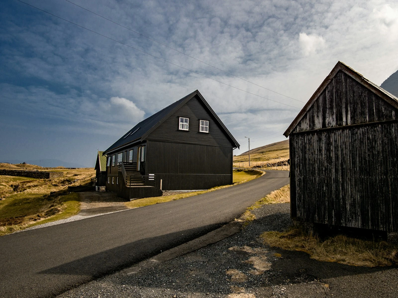
Symmetry: If your composition is symmetrical (or nearly so), centering reinforces that symmetry. Fighting it with thirds placement creates visual confusion.
Simplicity and power: Sometimes you want the viewer to look at exactly one thing with no ambiguity, and centering says "here it is" with a directness that thirds placement softens.
Formal subjects: Architecture, product photography, and certain portrait styles all benefit from presentation rather than observation, and often work better centered.
Graphic compositions: When you're creating an image that's more graphic than narrative, centering can strengthen the visual impact.
I've made some of my favorite portraits with the subject dead center, eyes meeting the camera. The "rule" says I should have shifted them to a thirds intersection. The images say otherwise.
The Decision Framework
When you're composing a shot, ask these questions:
What's the relationship between subject and environment?
- Environment matters → Consider thirds
- Subject dominates → Consider centering
What's the emotional tone?
- Observational, narrative, casual → Consider thirds
- Confrontational, powerful, direct → Consider centering
Is there symmetry in the scene?
- Yes → Centering usually strengthens it
- No → Thirds often creates better balance
Where do you want the viewer's attention?
- Distributed across the frame → Thirds
- Locked on the subject → Centering
What feeling do you want?
- Dynamic, active, in motion → Thirds
- Stable, grounded, still → Centering
This is a starting point for deliberate decision-making, not a formula. The right answer depends on your specific image and intent.
The Thirds Variations Nobody Talks About
The rule of thirds is actually a family of placement options, and which variation you choose matters.
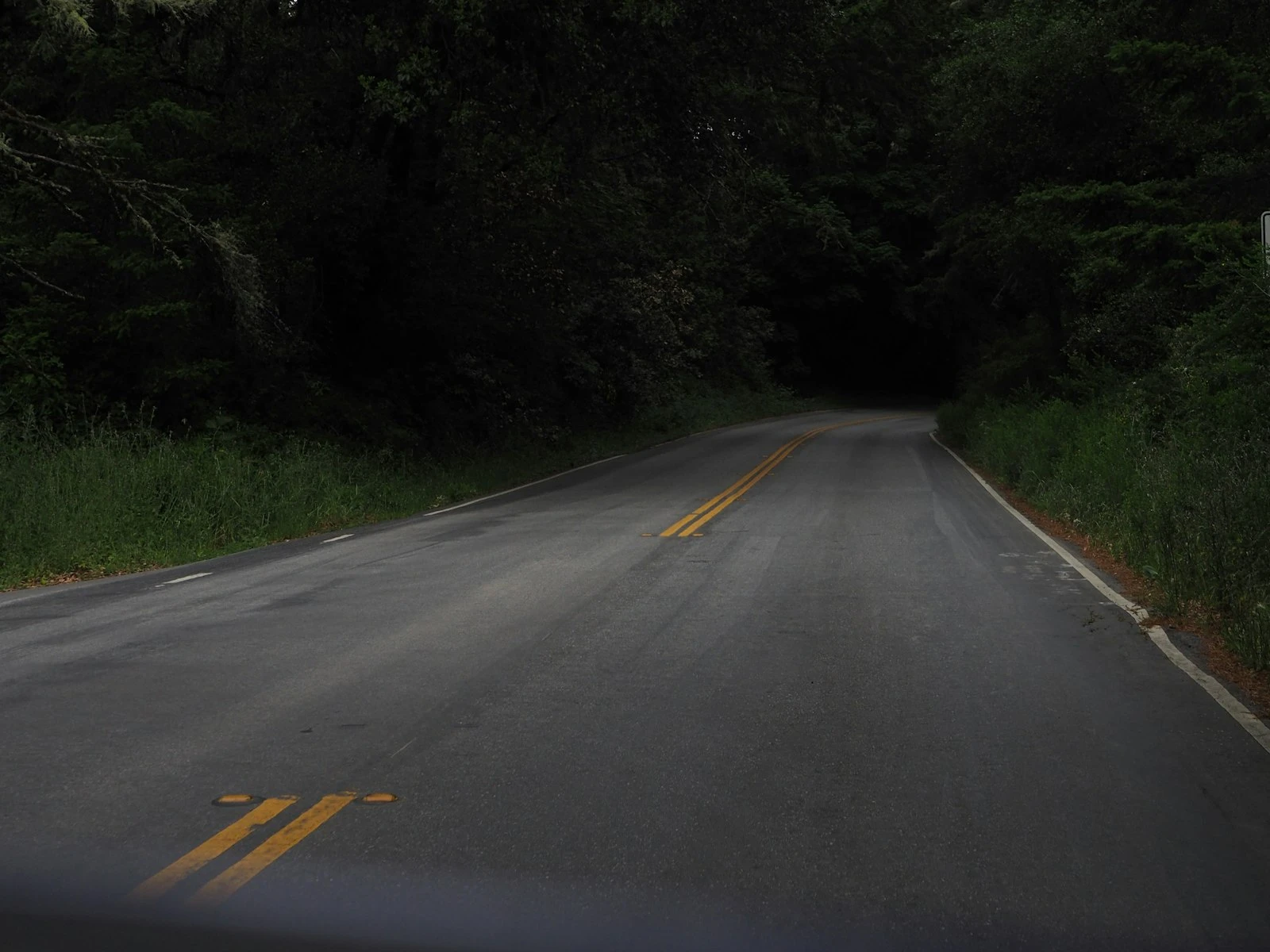
Subject on left third vs. right third: In Western cultures, we read left to right, so subjects on the left third feel like beginnings while subjects on the right feel like endings. A person on the left third with empty space to their right implies they're moving into something. Flip it, and they feel like they're leaving.
Subject on top third vs. bottom third: Top-third placement creates lightness, aspiration, sometimes vulnerability (less ground to stand on). Bottom-third placement feels grounded, stable, weighty. This plays directly into horizon placement decisions in landscapes.
Intersection choice: The four intersection points aren't interchangeable. Top-left suggests entering the frame. Bottom-right suggests settling or concluding. These aren't strict rules, but they're worth considering when fine-tuning placement.
Near-thirds vs. exact thirds: You don't have to hit the intersections precisely. Sometimes slightly off-thirds creates more tension than exact thirds. The "rule" is a region, not a coordinate.
Breaking the Rule Effectively
If you're going to center a subject that "should" be on thirds, commit to it fully. Approximate centering looks like a mistake. Dead centering looks like a choice.
The same applies to other placement decisions. If you're putting a subject at the extreme edge of the frame, make it clearly intentional. Wishy-washy placement that's neither thirds nor edge nor center looks accidental.
Breaking the rule works when:
- You have a clear reason
- The placement is obviously deliberate
- Other elements support the choice (symmetry, simplicity, direct eye contact)
Breaking the rule fails when:
- You're just being different
- The placement looks accidental
- It creates tension without purpose
What I Actually Do
When I'm shooting, I think "where does this subject need to be for this image to work?"
Sometimes that's a thirds intersection. Often, actually, because the rule exists since it frequently produces pleasing results. But I'm choosing it because it serves the image, not because it's the rule.
For portraits with direct eye contact, I often center. For environmental portraits where the setting tells part of the story, I usually place the subject on thirds. For symmetrical architecture, I center. For landscapes with a clear foreground element, I use thirds to create visual flow through layers.
The grid is a tool and not a mandate.
Practice Exercise: The Same Subject, Three Ways
Find a simple subject like a coffee cup, a flower, or a friend who'll sit still. Photograph it three ways:
- Centered, filling much of the frame
- On a left thirds intersection with space to the right
- On a right thirds intersection with space to the left
Now look at the three images, because they're not just different placements but different feelings. The centered image confronts you. The left-placement implies forward movement. The right-placement implies arrival or completion.
None is correct on its own, and each communicates something different.
The actual lesson of the rule of thirds is that placement is communication. Choose the placement that says what you want to say.
Key Takeaways
- Treat the rule of thirds as a decision tool, not a default; ask whether the subject needs space to interact with its environment or direct confrontation with the viewer.
- Use thirds placement for dynamic, narrative, or observational images where environment matters, and centering for confrontational, powerful, or symmetrical compositions.
- Commit fully to your placement choice, since approximate centering looks like a mistake while dead centering looks intentional.
- Left-thirds placement implies forward movement while right-thirds implies arrival, so choose based on the visual story you want to tell.
More in This Guide
Continue exploring composition techniques.