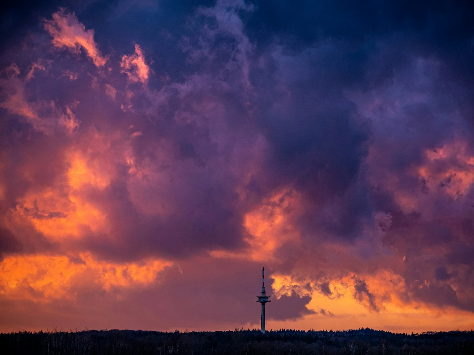
We've all seen landscapes with nuclear sunsets, radioactive green grass, and colors that never existed in nature. Over-edited landscape photos are everywhere, and they're often the result of photographers chasing impact without understanding restraint.
Good landscape editing enhances what was there by bringing out detail, balancing tones, and guiding the viewer's eye. Great editing is invisible, where viewers don't notice the processing and just see a beautiful image.
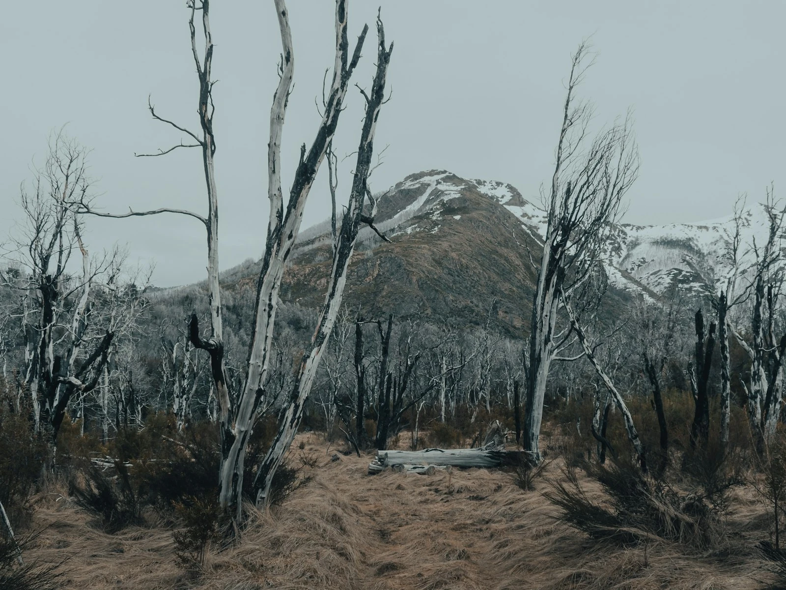
This guide covers practical techniques for editing landscapes in ways that look natural while still making the most of your raw files. It's one of the most popular topics in our landscape guide.
The Goal of Landscape Editing
Before touching any sliders, clarify what you're trying to accomplish.
What Editing Should Do
Correct technical limitations. Cameras don't see exactly what our eyes see. They compress dynamic range, miss shadow detail, and sometimes render colors inaccurately. Editing can restore what was actually there.
Guide the viewer. Subtle tonal and color adjustments direct attention to your intended subject and away from distractions.
Express your experience. The photograph should convey what it felt like to be there, capturing the mood and feeling of the moment rather than literally replicating raw reality.
Prepare for output. Different destinations (screen, print, web) require different adjustments to look their best.
What Editing Shouldn't Do
Create what wasn't there. Adding dramatic color where none existed misrepresents the scene and looks fake to experienced viewers.
Overwhelm the image. If the first thing viewers notice is the editing (HDR halos, oversaturation, artificial-looking details), the processing has failed.
Compensate for poor capture. Editing can't fix genuinely bad images. If you missed the light or botched the composition, no amount of processing helps.
The Foundation: A Good RAW File
Editing starts with capture. The better your raw file, the less work required and the more natural the results.
Expose to Protect Highlights
In landscape photography, blown highlights (completely white areas with no detail) are difficult or impossible to recover. Expose conservatively to protect bright areas, even if shadows look dark. Shadow recovery in RAW processing works better than highlight recovery.
Shoot RAW
JPEG files have already been processed by your camera, reducing flexibility. RAW files contain all captured data, giving you full control over white balance, tonal adjustments, and color.
If you're serious about landscape photography, RAW is non-negotiable.
Get It Right in Camera
The more you accomplish while shooting, like good exposure, correct white balance, and strong composition, the less correction needed later. Aim for raw files that need minimal repair and only require enhancement.
A Natural Editing Workflow
Rather than randomly adjusting sliders, follow a logical sequence that builds a finished image step by step.
Step 1: Global Corrections
Start with adjustments that affect the entire image.
White balance. Correct any color cast, or deliberately warm/cool the image to match the mood you remember. For sunrise/sunset, you may want to preserve or enhance warmth. For overcast conditions, neutral or slightly cool may feel accurate.
Exposure. Adjust overall brightness to where you want it. Not necessarily "correct" but appropriate for the mood. Darker exposure creates drama; brighter creates airiness.
Contrast. Add contrast to increase punch and clarity, or reduce it for a softer look. Most landscape images benefit from slight contrast increase.
Step 2: Tone Management
Now address specific tonal regions.
Highlights. Recover bright areas that are nearly blown. Don't pull highlights so far that the sky looks gray and dead. Some brightness is natural.
Shadows. Lift dark areas to reveal detail. But don't overdo it. Shadow areas should still feel like shadows, not equally bright as highlights.
Whites and Blacks. Set the endpoints of your tonal range. Some pure white and pure black add contrast and visual snap. Images with no true whites or blacks often look flat.
The histogram check. After tonal adjustments, review your histogram. It should span most of the range without major gaps or clipping at either end.
Step 3: Clarity and Texture
These adjustments affect mid-tone contrast and detail rendering.
Clarity. Increases mid-tone contrast, adding punch and definition. Landscapes often benefit from +10 to +30 clarity. Negative clarity creates a dreamy, soft look.
Texture. Affects fine detail. Positive values enhance texture (good for rocks, bark, grass). Negative values smooth texture (sometimes useful for skin or water).
Warning: Both adjustments are easy to overdo. Stop before images look "crunchy" or artificially sharp.
Step 4: Color Adjustments
Now address color saturation and rendering.
Vibrance. Boosts saturation of muted colors more than already-saturated colors. This "smart" saturation is usually more natural-looking than straight saturation. +10 to +25 is typically sufficient.
Saturation. Affects all colors equally. Use sparingly, rarely more than +10 for natural results. Many landscape images benefit more from vibrance than saturation.
HSL adjustments. For precise control, adjust hue, saturation, and luminance of individual color ranges. Common landscape adjustments:
- Shift orange/yellow hues slightly to separate greens from yellows
- Reduce blue saturation to avoid unnaturally vivid skies
- Increase luminance of greens or blues to brighten those areas
Step 5: Local Adjustments
After global adjustments, refine specific areas.
Graduated filters can darken skies, brighten foregrounds, or adjust color balance in specific regions.
Radial filters can lighten subjects or darken edges (a subtle vignette).
Brush adjustments target specific elements, such as brightening a rock, darkening a distraction, or increasing clarity on a key subject.
The principle: Direct attention toward your subject and away from distractions through selective lightening, darkening, and contrast.
Step 6: Final Adjustments
Sharpening. Apply output-appropriate sharpening. More for print, less for screen. Zoom to 100% to evaluate. Sharpening should enhance detail without creating halos.
Noise reduction. If you shot at high ISO, apply luminance noise reduction. Balance noise reduction against detail loss.
Vignette. A subtle darkening of corners directs attention toward the center. Keep it light, because obvious vignettes look amateurish.
Crop. If the composition can be improved by cropping, do it. But significant cropping suggests a capture-stage problem.
How to Avoid the Overdone Look
The difference between natural and overdone editing often comes down to restraint.
The Common Mistakes
Oversaturation. When colors glow unnaturally, saturation has gone too far. Real grass isn't neon green. Real sunsets have soft gradients, not nuclear orange.
HDR halos. Excessive shadow recovery and highlight compression creates glowing edges around subjects, the telltale sign of heavy-handed processing.
Clarity overload. Too much clarity makes images look harsh, crunchy, and exhausting to view.
Unnatural sky. Skies that are too dark, too blue, or too dramatic relative to the land beneath them scream "edited."
Lost shadows. Lifting all shadows to equal brightness eliminates depth and dimension. Shadows should still be darker than highlights. This is one of the main reasons landscape photos look flat.
Self-Check Questions
Before calling an edit finished, ask yourself:
Would these colors occur in nature? If the answer is no or uncertain, dial back saturation.
Do the shadows still look like shadows? Some darkness is natural and necessary.
Does the sky match the land? Sky and land should feel like they belong in the same photograph.
What's the first thing I notice? If it's the editing rather than the scene, adjustments need reducing.
Would I believe this scene if I weren't the one who edited it? Be honest.
The Step-Back Test
After editing, step away for a few minutes, or overnight if possible. Return with fresh eyes. Images that looked perfect often reveal their excess after a break.
What seemed dramatic initially may appear garish on second viewing. What felt subtle may actually be just right.
Compare to Reality (and to Quality Work)
Compare your edits to your memory of the scene. If the editing has diverged wildly from what you experienced, consider why.
Also compare to landscape work you admire, specifically work from photographers whose style you respect. Do their edits look similar in intensity to yours?
Handling High-Contrast Scenes
Landscapes often present more dynamic range than cameras can capture. Bright sky, dark foreground. The classic challenge.
Graduated Filter Solution
In post-processing, use a graduated filter to darken the sky while leaving the foreground unaffected. This mimics optical graduated ND filters.
Application: Draw a gradient across the horizon line. Reduce exposure by 0.5 to 1.5 stops. Adjust to taste, ensuring the effect looks natural.
Exposure Blending
For extreme situations, blend multiple exposures:
- Take one exposure for highlights (sky properly exposed, foreground dark)
- Take one for shadows (foreground properly exposed, sky blown)
- Blend the properly exposed regions in post
This can produce natural results but requires careful technique to avoid obvious blending lines.
Accept Some Limitations
Not every scene can be captured with full detail in both highlights and shadows. Sometimes the most natural result accepts some compromise, like a slightly dark foreground or slightly bright sky, rather than aggressive processing that looks forced.
Style Versus Excess
There's an important distinction between having an editing style and overdoing it.
Developing a Style
Over time, you may develop preferences: cooler or warmer tones, higher or lower contrast, more or less saturation. This becomes your editing "voice."
A consistent style isn't overprocessing if it produces natural-looking results. Many respected landscape photographers have distinctive looks that still appear believable.
When Style Becomes Excess
Style crosses into excess when:
- Results no longer look like photographs of real places
- Processing overwhelms the subject
- Every image looks exhaustingly dramatic
- The editing attracts more attention than the landscape
Style should serve the image, and when it dominates, it becomes overprocessing.
Software Considerations
The principles above apply regardless of your editing software, but different tools have different strengths.
Lightroom/Camera Raw
Adobe's tools offer comprehensive landscape editing with non-destructive workflow. The gradient and brush tools are particularly useful for landscapes. The standard choice for most photographers, and a set of landscape presets can give you solid starting points while you develop your own style.
Capture One
Often preferred for color handling and tethered shooting. Strong tools for local adjustments. Popular with professionals.
Luminar/ON1/DxO
Various alternatives with different feature sets and AI-assisted tools. Some AI features risk overprocessing if relied upon too heavily.
The Tool Matters Less Than the Eye
Any modern editing software can produce natural-looking results or overprocessed disasters. Your choices determine the outcome far more than the tool does.
Practice Exercise
Take one landscape image through this process:
- Edit normally, following your typical workflow
- Note your slider values
- Reset and start over, but this time use half the adjustment strength for every slider
- Compare the two versions
Many photographers discover that version two, the restrained version, looks more natural and equally impactful. The excess in version one added nothing beneficial.
This exercise calibrates your sense of restraint and helps develop the "less is more" instinct that produces natural-looking landscape edits.
Key Takeaways
- Expose to protect highlights in camera, then recover shadows in post, since blown highlights are unrecoverable but dark shadows often contain usable detail.
- Use graduated filters or luminosity masks to balance bright skies with dark foregrounds rather than pushing Highlights and Shadows to extremes.
- Keep saturation increases subtle and targeted, because oversaturated landscapes are the most common editing mistake and natural colors rarely need dramatic boosting.
- Let some shadows remain dark and some highlights stay bright, since tonal contrast is what gives landscapes depth and dimension.
More in This Guide
Continue exploring landscape photography.