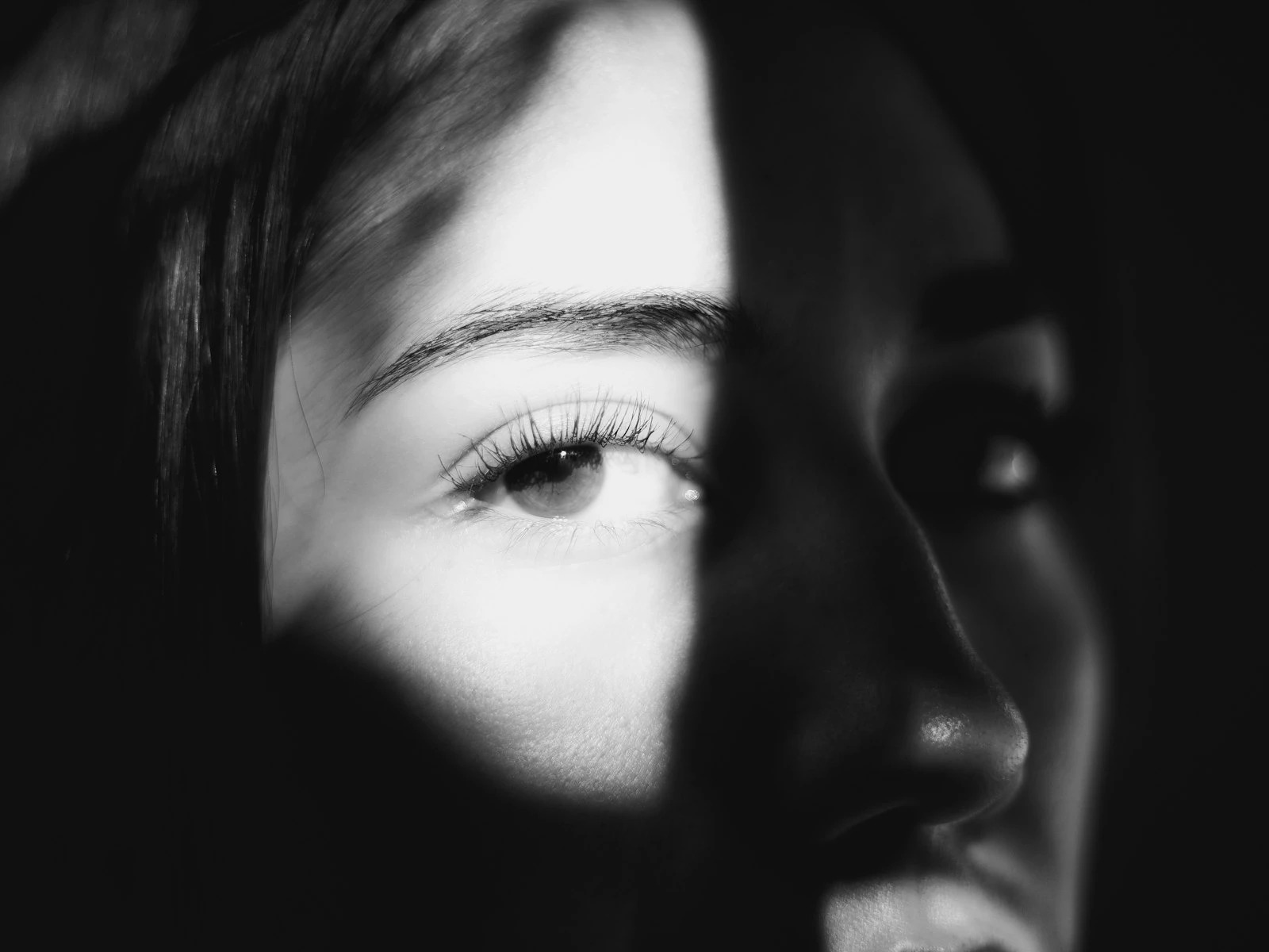
A portrait is a person in a context. That context is your background, and it's making an impact whether you're thinking about it or not.
Bad backgrounds are everywhere in amateur portraits: trees growing from heads, bright signs pulling attention from faces, cluttered environments that compete with subjects. These are failures of seeing.
The background is part of your frame. It affects how viewers perceive your subject, whether your image feels professional or casual, and where attention naturally lands. Learning to see backgrounds as decisions rather than accidents is one of the fastest ways to improve your portraits, and it's a recurring theme in our portraits guide.
Why Backgrounds Go Wrong
Background problems happen for predictable reasons.
Focus on the subject, blindness to the rest. When you're concentrating on your subject, like their expression, their pose, the light on their face, it's easy to completely miss what's behind them. Your attention narrows, and you simply don't see the background until you look at the image later.
Hoping bokeh will fix it. Wide apertures can blur backgrounds beautifully, but they don't eliminate problems so much as soften them. A blurry bright spot is still a distraction, and a blurred tree branch is still "growing" from someone's head.
Accepting what's there. Many photographers photograph people where they find them, without considering whether three steps to the left would give a completely different background.
Not understanding what competes. Some backgrounds look fine in person but compete viciously in photographs because our brains filter out distractions in real life while cameras record everything equally.
Good background selection is mostly about attention. Once you start looking, the problems become obvious.
The Hierarchy Principle
Your subject should dominate the visual hierarchy. Everything else in frame should support that dominance, not compete with it.
Ask yourself what's the brightest thing in the frame, what has the most contrast, and what has the most saturated color. If the answer is "something in the background," you have a problem.
The subject should generally be:
- Brighter than the background, or at least not darker
- Higher contrast (more defined) than the background
- More colorful than the background, or at least not less colorful
- The sharpest element in the frame
Backgrounds should generally be:
- Simpler than the subject
- Lower in contrast
- Less saturated or complementary in color
- Out of focus enough to recede but not so blurred they become unrecognizable shapes
When backgrounds support rather than compete, the eye naturally goes to your subject and stays there.
What Makes Backgrounds Distracting
Certain elements reliably pull attention from your subject.
Bright spots: Windows, sky, lights, reflections. Bright areas attract the eye. A bright spot behind someone's head acts like an arrow pointing "look here instead."
High contrast areas: Strong lines, text, sharp patterns. These have visual weight that competes with your subject.
Recognizable objects: Signs, text, faces of other people. Our brains are programmed to recognize faces and read text, so if these are in the background, they'll compete.
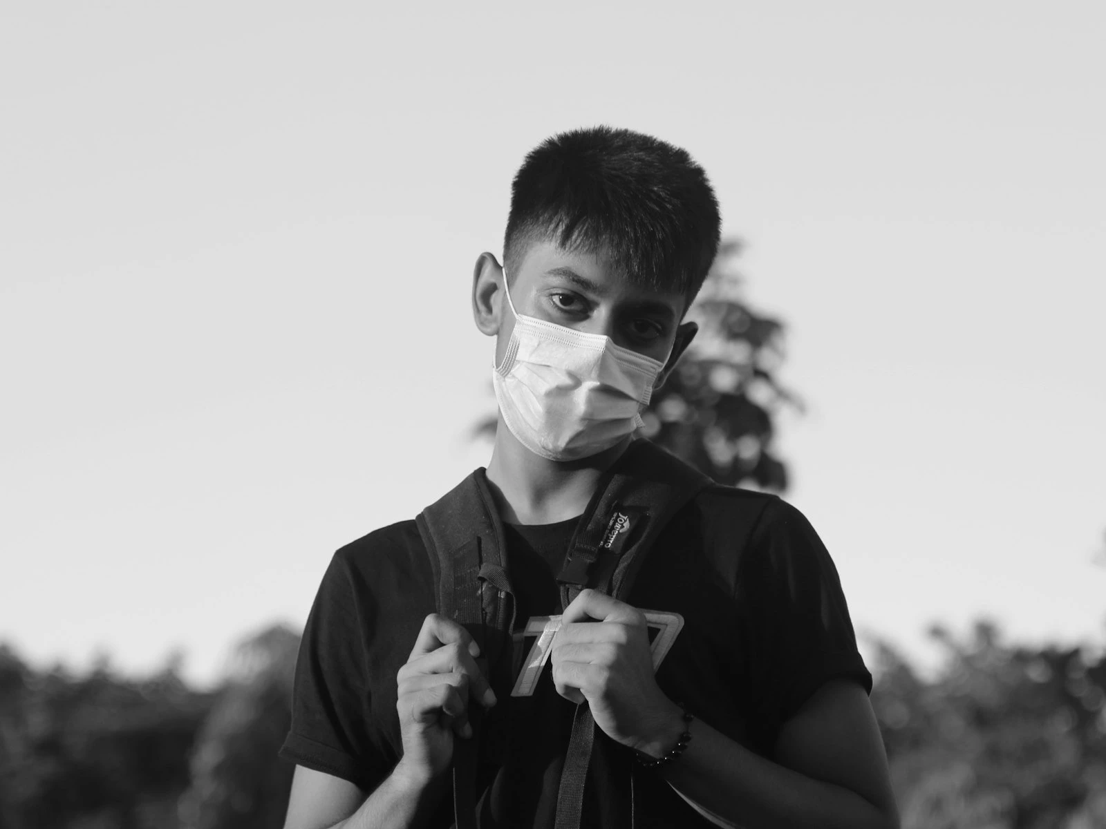
Mergers: Poles, branches, or lines that appear to touch or emerge from your subject. The classic "tree growing from head" happens when background elements align with the subject in distracting ways.
Clutter: Too many objects, too many colors, too much going on. Visual noise makes it hard to focus on anything.
Competing colors: A subject in blue against a background with red, yellow, and orange pulls attention multiple directions.
Movement or people: Other humans in the background, especially if recognizable, distract significantly. People look at people.
What Makes Backgrounds Work
Effective portrait backgrounds share common characteristics.
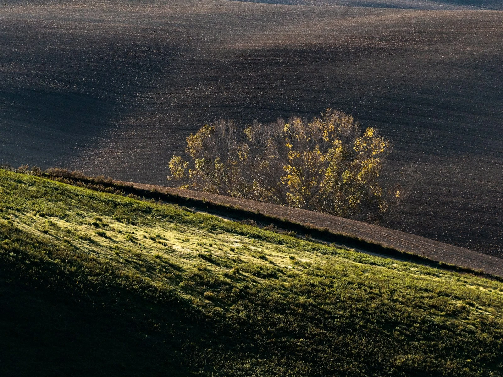
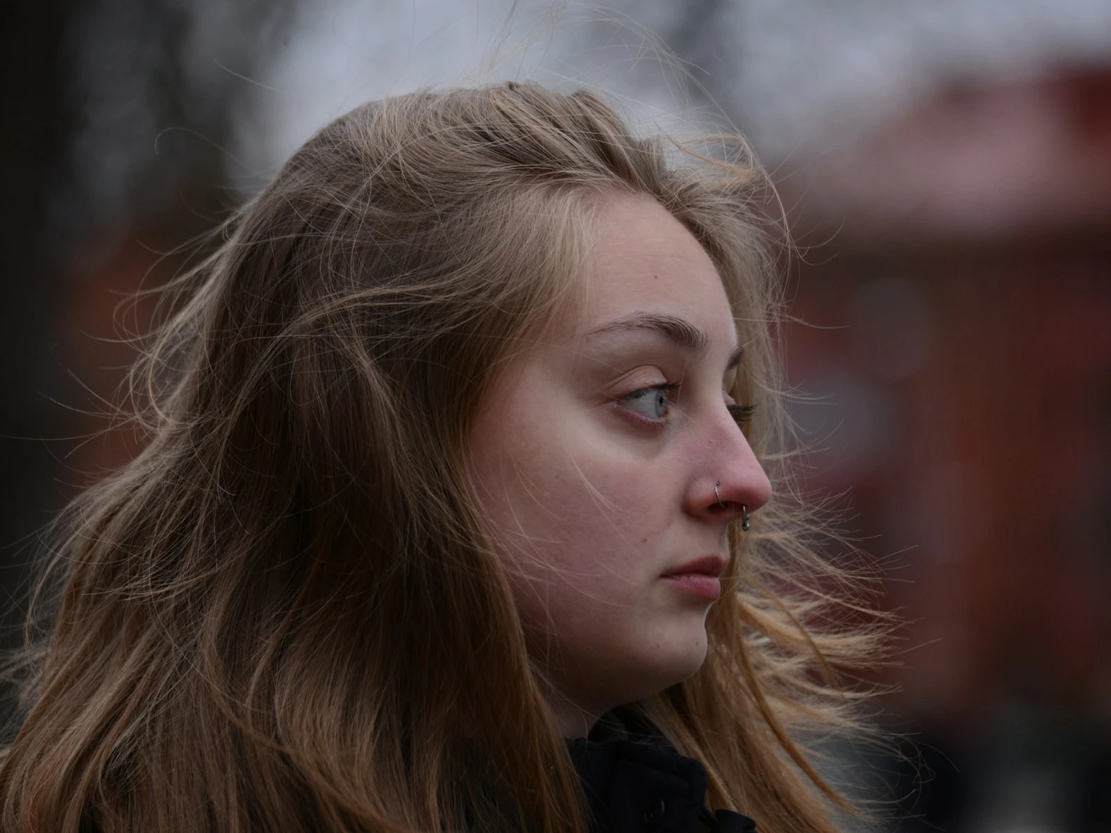
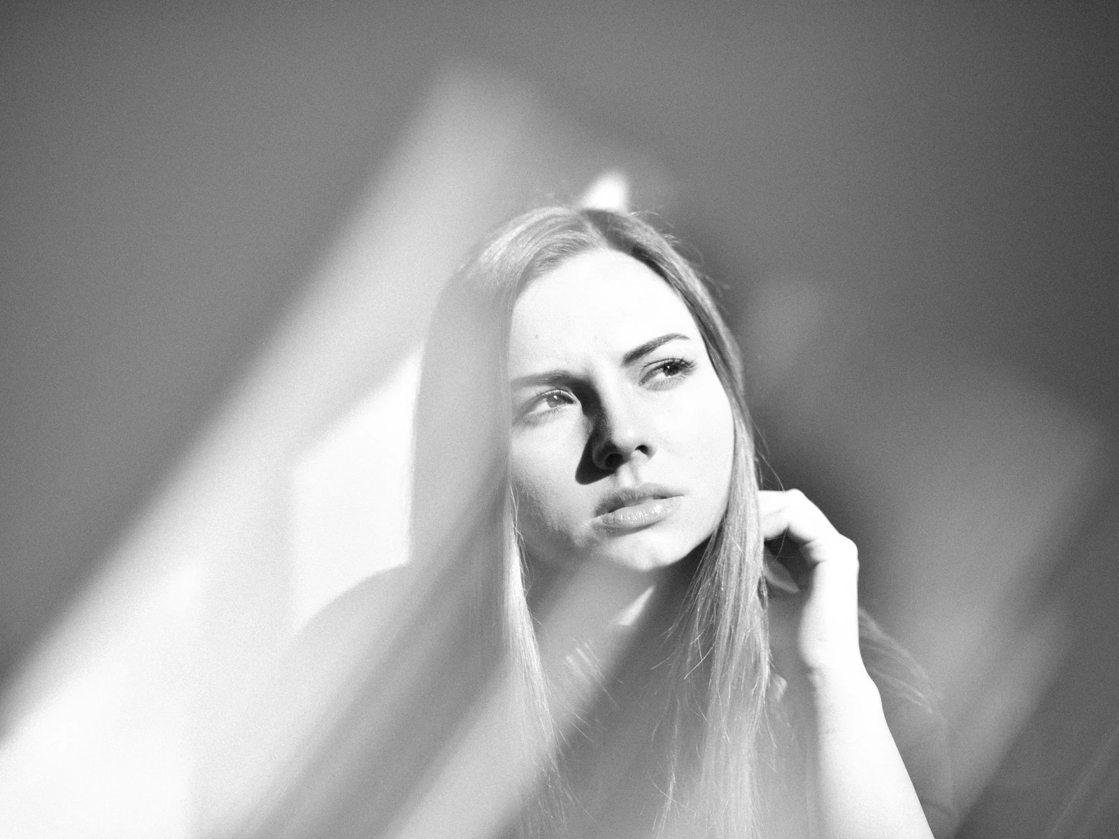
Simplicity. Less going on means less competition. A plain wall, a uniform shade of foliage, an even expanse of sky. Simple backgrounds keep focus on the subject.
Tonal separation. The subject should stand out from the background tonally. Dark subject against light background, or vice versa. When subject and background are too similar, the subject gets lost.
Color harmony. Backgrounds that complement or contrast intentionally with the subject's coloring look professional. Chaotic color relationships look accidental.
Depth and distance. Physical distance between subject and background allows for natural blur and creates a sense of dimension.
Relevance. Environmental portraits use backgrounds that tell part of the story: a chef in their kitchen, an artist in their studio. The background isn't simple, but it's intentional.
Leading lines that lead to the subject. If there are lines in the background, they should guide the eye toward the person, not away.
Simple Background Options
When in doubt, simple works:
Plain walls. Interior or exterior walls with minimal texture provide clean backgrounds. Paint color can complement or contrast with your subject.
Open shade. The dark area inside shaded space often serves as a simple, deep background when you expose for the subject.
Distance to chaos. If the environment is busy, distance blurs it into abstraction. Position your subject far from the background and use a wide aperture.
Sky. Shooting slightly upward with sky as background creates simplicity. Watch for overexposure and position so the subject doesn't look like a silhouette.
Natural foliage. Greenery at a distance, blurred with wide aperture, creates a pleasant, neutral background. Watch for distracting branches or highlights.
Seamless paper or fabric. In controlled environments, a roll of background paper or hung fabric eliminates variables entirely.
Finding Better Backgrounds
When your current background isn't working, try these adjustments.
Changing your position. Moving yourself changes the relationship between subject and background dramatically. Circle around and see what's behind them from different angles.
Moving your subject. Three steps to the left might put a tree behind them instead of a parking lot. Look for the best background, then position your subject in front of it.
Changing your height. Shooting from lower puts more sky behind them. Shooting from higher can eliminate horizon lines and put ground or foliage behind them.
Changing your focal length. Longer lenses compress backgrounds, including less area. Wider lenses include more background area but push it away.
Increasing subject-background distance. Move the subject away from the background. This creates more blur and reduces the impact of background elements.
Using aperture for blur. Wider apertures (smaller f-numbers) blur backgrounds more. This is useful but doesn't eliminate problems. It softens them.
Knowing your depth of field at a given aperture and distance helps you plan the blur before the shoot.
Environmental Portraits
Not all portraits need simple backgrounds. Environmental portraits deliberately include surroundings that provide context.
The setting tells the story. A farmer in their field, a musician with their instruments, a chef in their kitchen. The environment adds information the viewer wants.
Relevance is key. Random environments distract rather than add. The background should clearly relate to the subject's identity or the story being told.
Hierarchy still matters. Even in busy environments, the subject should remain dominant. This might mean positioning, lighting differences, or selective focus.
Clutter versus context. A workshop background should include relevant tools, not random junk. Edit the environment if possible, or choose camera angles that include relevant elements and exclude irrelevant ones.
Environmental portraits require more skill precisely because you're working with complexity instead of eliminating it.
The Background Check
Before you press the shutter, do a background scan.
-
Look at the entire frame, not just the subject. Force your attention to the edges and background.
-
Check for mergers. Is anything "touching" or "growing from" your subject? Poles, branches, signs at head level?
-
Identify bright spots. What's the brightest thing in the frame? Is it your subject?
-
Look for distracting elements. Text, faces, high-contrast patterns, movement?
-
Consider simplification. Could you move, change angle, or adjust aperture to simplify?
This takes a few seconds and prevents hours of wishing you'd noticed that neon sign behind their head.
Post-Processing Considerations
Some background issues can be addressed in editing.
Cropping. Tighter crops eliminate background problems at frame edges. This is often the simplest fix.
Selective darkening. Bright background elements can be darkened using local adjustments or dodging/burning.
Desaturation. Colorful background distractions can be desaturated to reduce their pull.
Blur tools. Some software can add additional blur to backgrounds, though this can look artificial.
Background removal. For significant problems, replacing backgrounds entirely is possible, but time-consuming and often obvious.
Prevention is faster than cure, and seconds of attention during the shoot save hours of editing.
Practice Exercise
Go to any location with your camera and a patient friend. Take one portrait with no thought to background. Just photograph them where they stand.
Then, without changing location, find five different backgrounds by:
- Changing your position
- Changing their position
- Changing your height
- Changing your focal length
- Changing subject-to-background distance
Compare the six images. Notice how dramatically the portraits change based on background alone. Same person, same location, completely different feels.
This exercise builds the habit of seeing backgrounds as variables rather than givens. Once you see it, you can't unsee it.
Key Takeaways
- Scan the background consciously before shooting, checking for bright spots, objects growing from heads, and competing visual elements.
- Move your subject away from walls and backgrounds to increase background blur and separation, even with moderate apertures.
- Shift your position a few steps in any direction to change what appears behind your subject, since small moves produce dramatically different backgrounds.
- Choose backgrounds that support the subject through simplicity or context, not ones that compete for the viewer's attention.
More in This Guide
Continue exploring portrait techniques.


Related Guides