Your LCD screen is a liar.
The same photo looks bright on a shaded screen and dark on a sunny one. Your eyes adapt to whatever ambient light you happen to be standing in, and the brightness setting on your camera shifts the image too. By the time you get home and load the files, half of what looked perfectly exposed in the field turns out to be clipped, muddy, or missing detail you can never get back.
The histogram is the fix. It is the one thing on your camera that tells the truth about exposure, regardless of where you are standing or what the screen looks like.
This guide is part of our camera settings hub, and it pairs closely with the exposure triangle, the light meter guide, and the troubleshooting in why your photos are too dark or too bright. Once you can read a histogram at a glance, those other pieces start to click.
What a Histogram Actually Shows
A histogram is a graph of brightness. It shows you how the pixels in your image are distributed across the full range of tones, from pure black on the far left to pure white on the far right.
The height of the graph at any given point tells you how many pixels in your image have that brightness level. A tall spike means lots of pixels at that tone. A flat valley means very few.
The Five Zones to Recognize
It helps to think of the horizontal axis as five rough zones, even though the actual scale is continuous.
- Far left. Pure black. Pixels here have no detail, just solid shadow.
- Left third. Shadows. Detail is preserved but the area looks dark.
- Middle third. Midtones. Skin, foliage, brick, most everyday surfaces live here.
- Right third. Highlights. Bright clothing, lit walls, sky.
- Far right. Pure white. No detail, just solid bright.
A well-exposed image usually shows data spread across most of the middle, with the curve approaching but not slamming into either edge. That is not a rule though, just a starting reference. A snowy landscape and a black cat against a dark wall are both perfectly exposed images with very different histograms.
Why "Pegged to the Edge" Matters
The two edges of the histogram are where exposure goes wrong in ways you cannot fix later.
Data pressed against the right edge means highlights are clipped. The brightest parts of your scene have been recorded as pure white, with zero detail. There is nothing in the file for you to recover, even from a raw file. A blown sky stays a blown sky.
Data pressed against the left edge means shadows are crushed. The darkest parts are pure black with no information. Raw files give you a little more room here (often a stop or two of recoverable shadow), but pushing that recovery hard usually introduces noise and color shifts.
The middle of the histogram is forgiving. The edges are not.
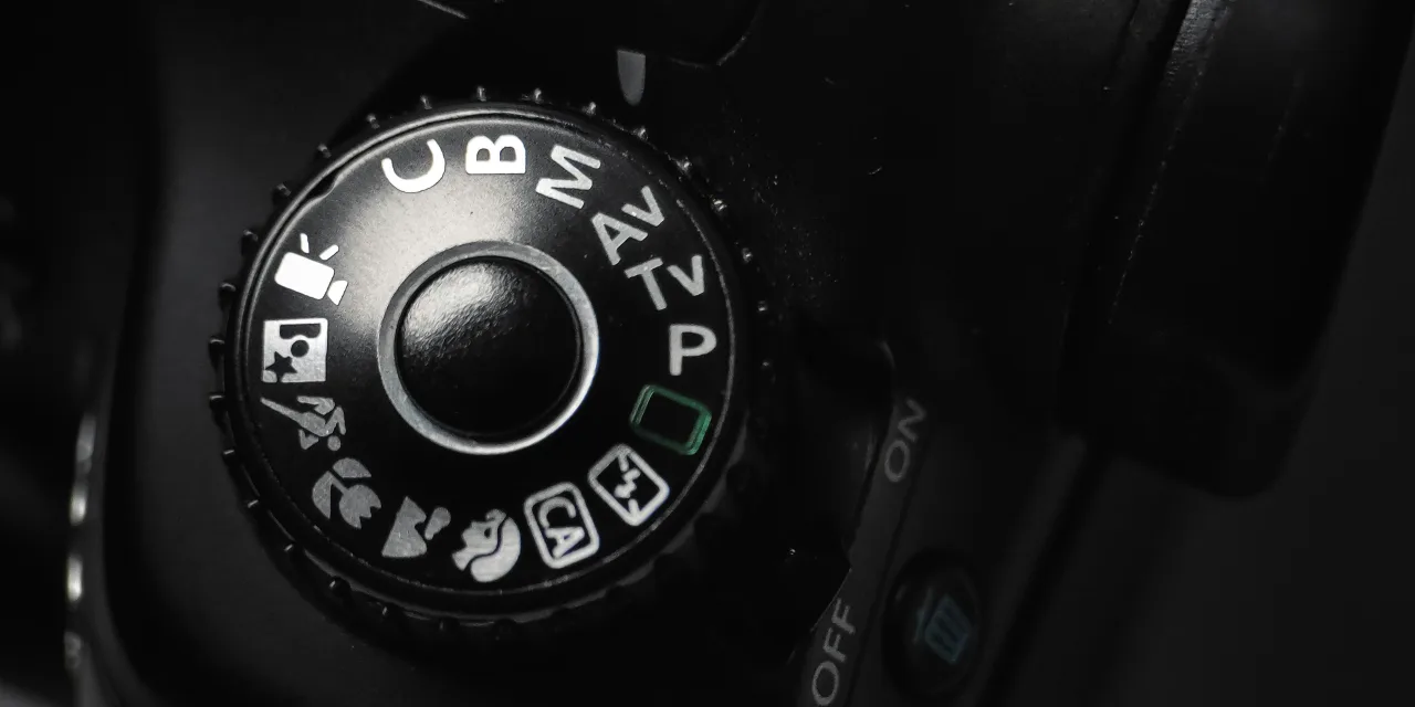
How to Pull Up the Histogram
Every modern camera shows a histogram, but it is rarely on by default. You usually have two options.
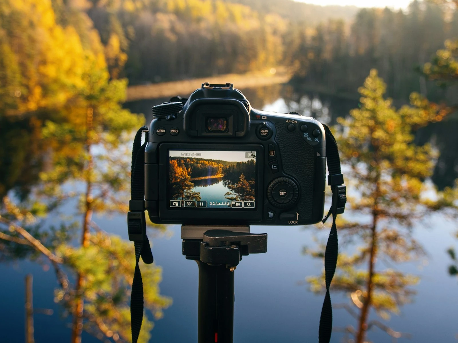
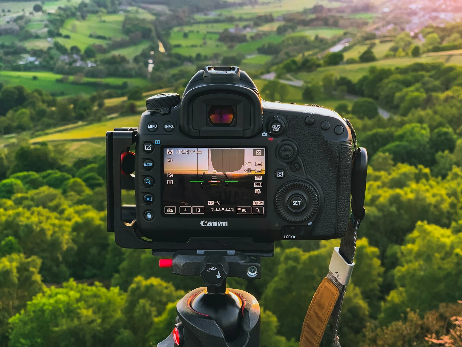
Playback histogram. After you take a shot, press the info or display button while reviewing the image. The histogram appears overlaid on or beside the photo. Most cameras let you cycle through a few different display modes to get there.
Live histogram. Many mirrorless cameras (and DSLRs in live view) can overlay a histogram on the screen or in the electronic viewfinder before you even press the shutter. This is the better option when you have it. You see exposure problems in real time and fix them before the shot, not after.
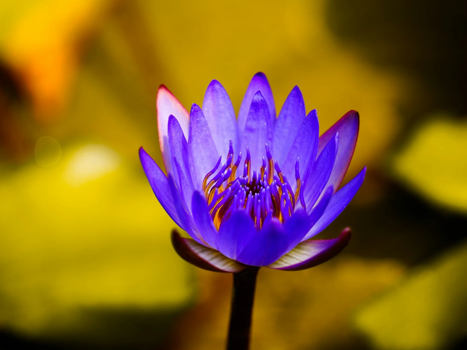
If your camera offers RGB histograms (separate channels for red, green, and blue), turn those on too. The luminance histogram averages all three. Sometimes one specific color clips before the overall luminance shows any problem. A bright red flower under a midday sun is a classic case where the red channel is gone long before the white-balanced luminance tells you anything is wrong.
Reading Common Histogram Shapes
Histograms come in roughly four common shapes, and recognizing them helps you decide what to do.
Centered, Bell-Curve Shape
Most pixels in the middle, tapering off toward both edges. This is the textbook "good exposure" for an average scene with a normal contrast range. A morning portrait, a flat-lit interior, an overcast landscape, all of these produce something close to a bell curve.
Nothing to fix. Take the shot.
Bunched on the Left (Low-Key Histogram)
Most of the data is in the shadows. Could be a deliberate low-key portrait, a night scene, or simply an underexposed image. The question to ask is whether the result looks the way you wanted it to look.
If shadows are pressed against the far left and important detail has been lost, that is underexposure. Open up the aperture, slow the shutter, or raise the ISO. If the scene actually is dark (a moonlit landscape, a silhouette against a bright sky), this shape is correct.
Bunched on the Right (High-Key Histogram)
Most of the data is in the highlights. Common for snow scenes, beach scenes, foggy mornings, white-on-white still life, and many studio portraits with bright backdrops.
If the curve is pressed against the right edge and you have lost detail in the brightest areas, that is overexposure. Pull the exposure down using whatever control you have available. If the scene is naturally bright and detail is preserved, the shape is just telling you the truth.
Twin Peaks (Bimodal Histogram)
A spike on the left, a spike on the right, very little in the middle. This is a high-contrast scene where bright and dark areas dominate and there is not much in between. Backlit subjects, deep shadows against bright windows, a sunset where the sky is brilliant and the foreground is dark.
This is where you have to choose what to protect. You usually cannot save both ends. Decide whether highlights or shadows matter more for the image you want, and expose to keep that side off the edge. The other side will clip. That is the cost of shooting a scene that exceeds your camera's dynamic range, and there is no way around it short of bracketing and merging in post.
Expose to the Right
This is a phrase you will hear in photography forums, often shortened to ETTR. It means deliberately exposing as bright as you can without clipping the highlights. Push the data toward the right edge of the histogram, then back it down in editing.
The reason it works: digital sensors record more information in the bright stops than in the dark stops. A raw file has roughly half its tonal data in the brightest stop alone. By exposing to the right, you capture more usable information and end up with cleaner shadows when you pull the file back down to taste.
ETTR has limits. If you push too far and clip highlights, you lose detail that no recovery can restore. The technique works best with raw files and a careful eye on the right edge of the histogram. For JPEG shooters, ETTR is risky because the file already has its tone curve baked in, and pushing exposure usually just blows highlights without much benefit.
For most situations, "as bright as possible without clipping" is the rule. The histogram is how you know exactly where that line is.
Using the Highlight Warning
Almost every camera has a feature called the highlight alert, blown highlight warning, or "blinkies." When enabled, clipped areas of your photo flash in playback so you can see exactly where the file has been blown out.
Turn it on. It is one of the most useful features your camera offers.
The histogram tells you that highlights are clipped. The blinkies tell you which highlights. Sometimes the answer is "only a small specular reflection on a chrome bumper, no big deal." Sometimes it is "the entire sky, and the photo is ruined." The two displays work together, and reading both takes about a second once it is a habit.
How the Histogram Saves You in Specific Situations
The histogram becomes most valuable when conditions are tricky. A few common cases.
Bright Scenes the Meter Wants to Darken
Snow, white sand, a bride in a white dress against a pale wall. Your camera's light meter assumes the world averages out to middle grey, so it tries to render bright scenes darker than they really are. The result is muddy, grey-looking whites.
The fix is exposure compensation, dialed positive by 1 to 2 stops. The histogram tells you how far to push. Add compensation until the histogram is well to the right but not pegged against the edge. That is correct exposure for the scene.
Backlit Subjects
A person standing in front of a sunlit window or a bright sky. The meter sees mostly bright light, dials the exposure down, and your subject turns into a silhouette.
If you want the face visible, you need positive exposure compensation. The histogram will shift right, the background will clip, and that is fine. You are deliberately blowing out the background to save the subject. The histogram makes the tradeoff explicit so you can see what you are doing.
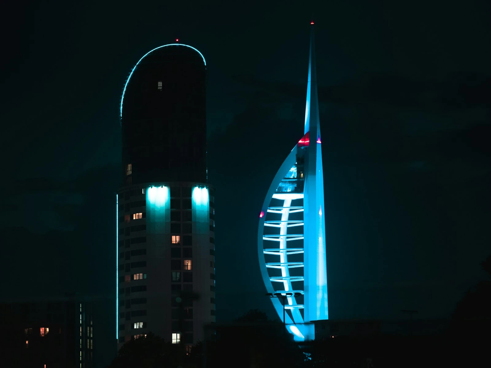
Night and Low Light Scenes
In night photography, the histogram naturally leans left because most of the scene is dark. The trick is making sure that lit highlights, like windows, street lamps, or neon, are not blown completely. A small spike on the right edge for the bright lights is usually acceptable. A wall of data pressed against the right edge is not.
The LCD is especially unreliable at night because your eyes are dark-adapted and the screen looks much brighter than the actual file. The histogram cuts through all of that.
Editing With the Histogram
The histogram is just as important in Lightroom and other editors as it is in the field. Most editing software shows a live histogram that updates as you move sliders, which means you can watch exactly what your adjustments are doing to the tonal range.
A few habits that pay off.
Watch the edges as you push. Raising Exposure or Whites pushes data to the right. Lowering Blacks pulls it to the left. If you see data slam into either edge, you have just clipped, and you should back off.
Check the channel histograms in raw editors. Lightroom and similar tools show triangle warnings in the top corners of the histogram when any channel clips. Click them to see exactly which pixels are clipped and decide whether you care.
Use it to push, not to chase. The histogram is a tool for verification, not a target. A "perfect" looking histogram does not mean a perfect-looking photo. Some images need to lean left or right to feel right. Let the image be the goal, and use the histogram to make sure you are not destroying detail in the process.
For dark photos, the histogram helps you see exactly which sliders are doing the heavy lifting when you fix the exposure in editing.
Common Mistakes With Histograms
A few patterns that trip people up.
Mistake. Trusting the LCD Instead of the Histogram
The LCD changes appearance based on ambient light and screen brightness. A bright outdoor environment makes everything look underexposed. A dark room makes everything look overexposed. The histogram is the same regardless of where you are standing.
Fix. Once you take a critical shot, glance at the histogram, not the image. If the curve looks right, the file is right.
Mistake. Thinking Every Histogram Should Look Like a Bell Curve
A snowy field, a black-clad subject against a black wall, a sunset, a silhouette, all of these produce histograms that look "wrong" but are actually correct. The shape of the histogram should match the scene.
Fix. Use the histogram to spot clipping, not to enforce a specific shape. Ask "is detail being lost at either edge" rather than "does this look like a bell curve."
Mistake. Ignoring the RGB Channels
The luminance histogram averages all three color channels. A bright red flower can blow the red channel completely while the luminance histogram looks fine. The result is a flat, detailless flower that no editing can recover.
Fix. When shooting saturated colors, especially bright reds, oranges, and yellows, check the RGB histograms or the channel warnings in your editor.
Mistake. Chimping Without Looking
It is easy to glance at the LCD, think the photo looks fine, and move on. Then later you find out the highlights were blown the whole time.
Fix. Train yourself to glance at the histogram (not the image) after the first few shots of any new lighting setup. Once exposure is dialed in, you can shoot freely until conditions change.
Key Takeaways
- The histogram is a graph of pixel brightness from pure black on the left to pure white on the right, and it is the only exposure reference on your camera that does not lie to you about what is actually in the file.
- Data pressed against the right edge means clipped highlights with no detail to recover. Data pressed against the left edge means crushed shadows. The middle is safe, the edges are not.
- The "correct" histogram shape depends on the scene. A snowy landscape leans right, a night scene leans left, and both can be perfectly exposed.
- Combine the histogram with the highlight alert ("blinkies") to see not just that you are clipping, but where, so you can decide whether the clipped area actually matters.
More in This Guide
Continue building your camera settings skills.
Related Guides