You've finished editing. The exposure looks good, the composition is right, but something about the colors feels off. Maybe you can't even articulate what's wrong, but it just doesn't look right.
Color problems are tricky because we're sensitive to them without being able to explain them. A slightly shifted green, an oversaturated red, or a muddy orange all register as "wrong" even when we can't identify the specific issue.
This guide helps you diagnose what's actually happening and fix it. It's one of the most common issues we address in our photo editing guide.
The Seven Color Problems
1. Global Color Cast
What it looks like: The entire image leans toward one color: too blue, too orange, too green, too magenta. Everything has a tint.
Why it happens:
- White balance wasn't set correctly in-camera
- Lightroom's auto white balance chose wrong
- You shot in mixed lighting and there's no "correct" setting
How to fix it: Start with white balance. Use the eyedropper tool on something that should be neutral, like a gray card, white paper, white clothing, or concrete. If you don't have a neutral reference, adjust Temperature and Tint by eye until skin tones (if present) look natural, or until the scene matches your memory of it.
If overall white balance is right but one area still has a cast (say, a face near a colored wall), use the Adjustment Brush to correct just that area.
2. Muddy, Desaturated Colors
What it looks like: Colors lack vibrancy. Everything looks gray-ish, flat, lifeless. There's color, but it's weak.
Why it happens:
- Overcast light naturally desaturates colors
- Camera profile might be rendering colors weakly
- You pulled Saturation or Vibrance down too far
- Heavy shadow recovery can desaturate darker colors
How to fix it: First, check Vibrance and Saturation since they might be accidentally reduced, then try increasing Vibrance moderately (+10 to +25). If specific colors are weak, use HSL Saturation sliders to boost them individually.
Also check your camera profile. Some profiles (like Adobe Standard) render colors more mutedly than others. Try switching to Camera Vivid or another option to see if it helps.
3. Oversaturated, Garish Colors
What it looks like: Colors are too intense. Sunset skies look radioactive. Skin looks sunburned. Greens look neon.
Why it happens:
- Saturation or Vibrance pushed too high
- Preset applied aggressive color boosting
- HSL saturation sliders cranked up
- Clarity can also intensify colors
How to fix it: Reduce Vibrance and Saturation. Check HSL panel for individual colors that might be over-boosted. If you applied a preset, reduce its intensity or reset and start over.
Natural colors are rarely as saturated as our editing tools can make them, so when in doubt, pull back.
4. Colors That Don't Match Reality
What it looks like: You remember the grass being a different green. The sky wasn't that blue. The flowers were more vibrant (or less). Colors are wrong from what you saw.
Why it happens:
- Memory is unreliable, and we often remember scenes as more colorful than they were
- Camera sensors don't capture color exactly as eyes see it
- White balance affects how all colors render
- Editing choices (intentional or not) shifted colors
How to fix it: This is partly philosophical. The "correct" color is the one that serves the image, which might not match literal reality. But if you want accuracy, there are some approaches that help.
Start with correct white balance. Use the Calibration panel if you find your camera consistently shifts certain colors. Use HSL Hue sliders to shift specific colors toward where they should be (e.g., shifting greens from yellow-green toward blue-green if landscape grass looks too warm).
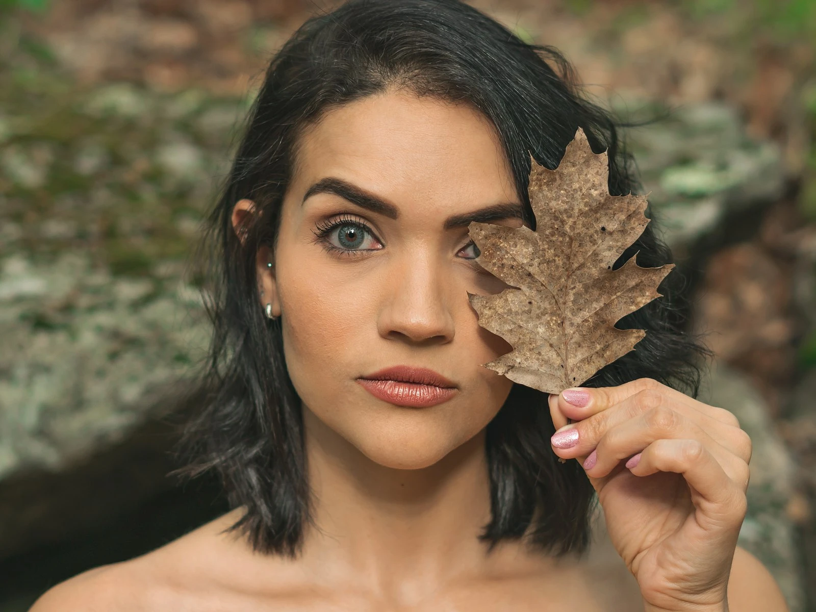
5. Unnatural Skin Tones
What it looks like: Faces look orange, gray, green, or otherwise wrong. Skin doesn't look like healthy human skin.
Why it happens:
- Global color adjustments affected skin
- White balance issues hit skin hardest
- Presets or HSL adjustments weren't designed with skin in mind
- Vibrance/Saturation pushed skin into unnatural territory
How to fix it: The skin tones guide covers this fully. The short version: fix white balance first, then use HSL to adjust Orange and Red channels if needed. Skin lives primarily in the Orange range.
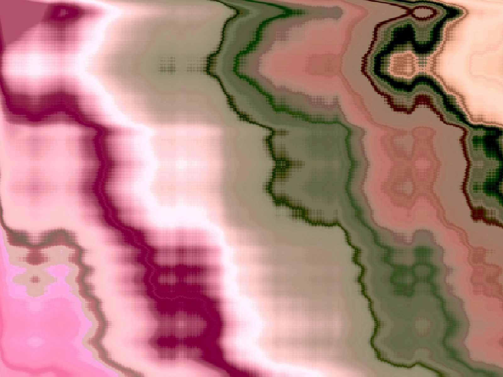
6. Color Banding and Posterization
What it looks like: Instead of smooth gradients (like in a sunset sky), you see visible stripes or steps between colors. Areas that should be continuous look chunky.
Why it happens:
- Heavy editing pushed the file beyond its limits
- Working with JPEG files (less color depth than RAW)
- Extreme adjustments to specific color ranges
- Exporting to a format with limited color depth
How to fix it: This is harder to fix because information has been lost or the file has been pushed too far. Prevention is better, so shoot RAW, make gentler adjustments, avoid common editing mistakes, and export to formats with good color depth.
If you're seeing banding, try reducing the intensity of your adjustments. Adding slight grain can mask banding in final images (it breaks up the visible steps).
7. Colors That Looked Good in Lightroom but Wrong Elsewhere
What it looks like: Your edit looked perfect on screen, but the exported image or print looks different: too saturated, too muted, different hues entirely.
Why it happens:
- Color space mismatch (editing in one color space, viewing in another)
- Monitor isn't calibrated
- Export settings are wrong
- Viewing on a different device with different display characteristics
How to fix it: For web use, export in sRGB color space since it's the standard for screens. For prints, use the color space your print lab recommends (often sRGB or Adobe RGB).
If colors consistently look different on your phone versus your computer, your monitor may need calibration. But also accept that some variation between devices is normal and unavoidable.
The Diagnostic Process
When colors look wrong and you're not sure why, work through this checklist.
1. Is white balance correct? Look at something that should be neutral (white, gray, black). Does it look neutral, or does it have a color cast? Fix this first because everything else depends on it.
2. Are all colors wrong, or just some? If everything looks wrong, it's probably white balance or a global adjustment (Vibrance, Saturation, a tone curve shift). If only certain colors look wrong, the problem is more targeted. Check HSL sliders and any local adjustments.
3. Did you apply a preset? Presets can make dramatic color changes you don't realize. Try resetting the HSL panel and color grading sections to see if the preset caused the problem.
4. Are you over-edited? Sometimes the issue is accumulated small changes. Each adjustment looked fine, but together they've shifted colors significantly. Consider resetting and starting over with lighter touch.
5. Is the problem consistent across devices? Check your image on your phone or another computer. If it looks fine there but wrong on your editing monitor, your monitor might be the problem, not the image.
When the Scene Was the Problem
Sometimes colors look wrong because the scene had genuinely difficult color conditions.
Mixed lighting: Different light sources with different colors (tungsten inside, daylight outside) create impossible situations because there's no white balance that corrects both. You might need local adjustments to correct different areas differently.
Reflected color: Light bouncing off colored surfaces adds that color to everything. A person standing near a red wall has red bouncing onto their skin. This can be corrected in post, but it's often subtle and hard to fully remove.
Extreme conditions: Heavy fog, smoke, or atmospheric haze add color casts that might be accurate to the scene but look wrong to viewers who weren't there.
In these cases, "fixing" the colors means choosing which interpretation you want, not finding the one correct answer.
Key Takeaways
- Fix white balance first, since most color problems are actually temperature or tint issues that affect the entire image.
- Use the eyedropper tool on something neutral (white, gray) to quickly correct global color casts before making targeted adjustments.
- Check whether the problem is global (white balance or Vibrance/Saturation) or targeted (specific colors shifted in HSL), then fix accordingly.
- Export in sRGB color space for web use, and accept that some color variation between devices is normal and unavoidable.
More in This Guide
Continue exploring editing techniques.