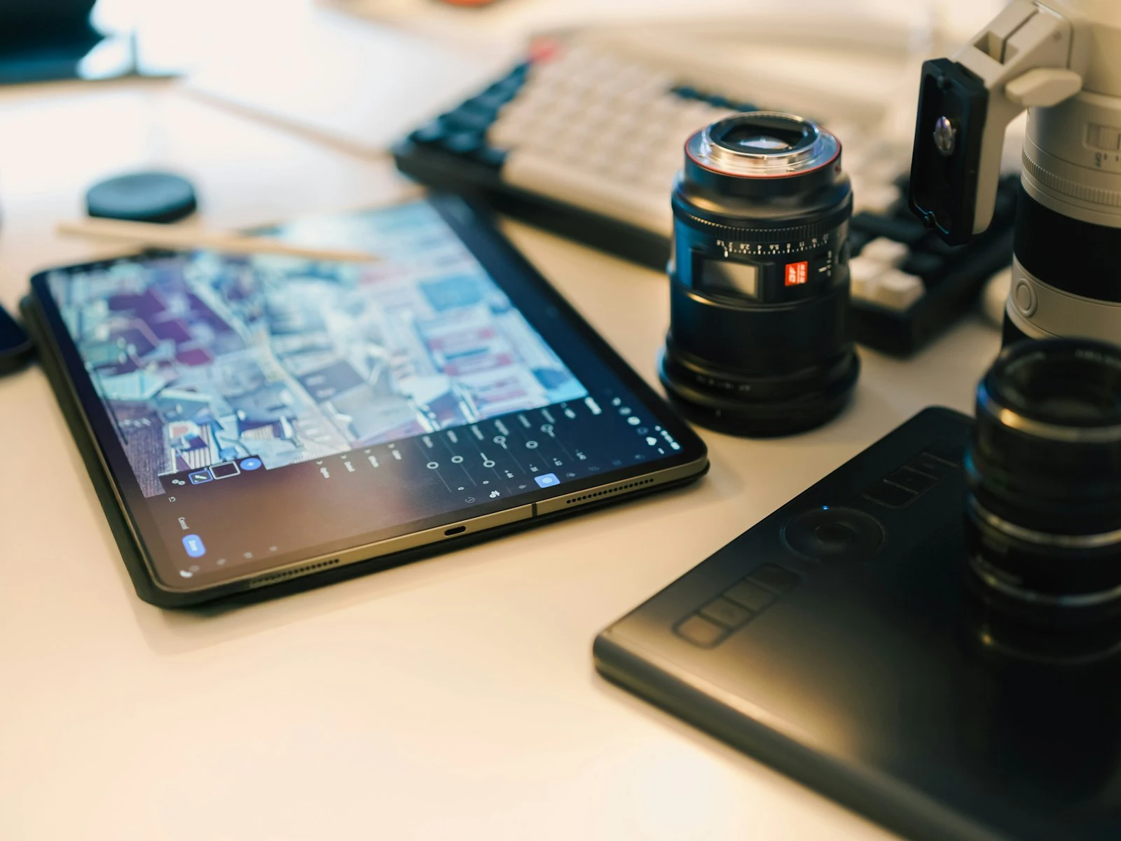
You've spent twenty minutes perfecting a photo. In Lightroom, it looks amazing: punchy colors, dramatic contrast, every detail popping. You export it, post it, and... something's wrong. It looks fake, overdone, and amateur.
This happens to everyone. Overprocessing is the single most common editing mistake, and it's one of the hardest to recognize while you're doing it.
Once you learn to see it, you'll never unsee it. And fixing the habit is just about developing restraint, which is a theme throughout our photo editing guide. (If editing terms like clarity, dehaze, or HDR are unfamiliar, our photography glossary has straightforward definitions for each one.)
What "Overprocessed" Actually Means
A photo looks overprocessed when the editing is more visible than the photo itself. Viewers end up seeing the work rather than the subject, the moment, or the feeling.
Your eye evolved to interpret light as it appears in the real world. When something breaks those rules too dramatically, it registers as "wrong" even if you can't articulate why.
Overprocessed photos trigger that response. They're technically viewable but emotionally hollow. The editing creates a barrier between viewer and image.
The Seven Signs of Overprocessing
1. Crunchy, Gritty Textures
What it looks like: Skin that looks like sandpaper. Fabric that shows every thread. An overall "harsh" feeling.
The culprit: Too much Clarity and/or Texture, combined with over-sharpening.
How it happens: Clarity makes images feel "punchy," so we keep pushing. Each increment looks okay, but they accumulate, and aggressive sharpening on top makes everything look like it's made of gravel.
The fix: Reset Clarity to zero and add back only as much as necessary. For portraits, that's often zero. For landscapes, maybe +15 to +30. Check at 100% zoom. If you can see sharpening halos around edges, you've gone too far.
2. Glowing Edges and Halos
What it looks like: Light "halos" around high-contrast edges, especially where subjects meet sky. People seem to glow.
The culprit: Excessive local contrast adjustments like Clarity, Dehaze, or the tone curve pushed too hard.
How it happens: These tools increase contrast along edges. A little creates definition, but a lot creates artificial glowing outlines that scream "edited."
The fix: Pull back Clarity and Dehaze. If you've used local adjustment brushes, check their Clarity settings. The effect that looks "dramatic" at full size often looks terrible when you zoom out or view on a phone.
3. Nuclear Sunset Colors
What it looks like: Skies that look radioactive. Orange and pink that would make a sunrise jealous. Colors more saturated than any sunset you've actually witnessed.
The culprit: Heavy Vibrance and Saturation boosts, often combined with HSL adjustments that push orange and yellow hues.
How it happens: Sunset and golden hour photos are already dramatic, and we boost saturation to "enhance" what was there without realizing we're pushing into impossible territory.
The fix: Ask yourself: would I believe this color if I hadn't taken the photo? If you photographed it, you know what the scene actually looked like. Trust that memory over your screen.
4. Cartoon Skin
What it looks like: Faces that look plastic. Skin with no texture, no pores, no life. The "beauty filter" look.
The culprit: Over-smoothing with noise reduction or dedicated skin-smoothing tools. Also, pushing Clarity into negative territory on skin.
How it happens: We want skin to look "flawless," but real skin has texture. Remove it entirely and you get something recognizably fake, deep in uncanny valley territory. The skin tones guide covers how to handle faces with a lighter touch.
The fix: Apply noise reduction only where needed. Keep Clarity at zero for portraits (not negative). If you must smooth skin, do it with a light touch and only on specific problem areas, not globally.
5. HDR Nightmare
What it looks like: Every surface has equal detail. Shadows as bright as midtones. A flat, surreal look where nothing recedes.
The culprit: Shadows pushed to maximum, Highlights pulled to minimum. The desire to "see everything."
How it happens: We see detail in shadows and want it visible, and we see clipped highlights and want them recovered. Pushing both to extremes removes the tonal depth that makes photos feel three-dimensional.
The fix: Let some shadows be shadows. Let some highlights be bright. Photos need contrast to have depth. The eye can't "see everything" in real life, so photos that show everything look unreal. Learning to read light helps you appreciate why some areas should stay dark. This is especially tempting with landscape shots where you want to show both bright skies and dark foregrounds.
6. Crushed Blacks and Blown Highlights
What it looks like: Deep shadows with no detail whatsoever (crushed blacks). Bright areas that are pure white with no gradation (blown highlights).
The culprit: Excessive contrast, or pushing Blacks and Whites too far.
How it happens: Sometimes in reaction to the HDR look, we overcorrect and remove too much shadow detail. Or we chase "punchy" contrast without watching where information is lost.
The fix: Hold Alt/Option while adjusting Blacks and Whites to see clipping. Some clipping is fine, even desirable, but losing detail in important areas hurts the image.
7. Unnatural Color Relationships
What it looks like: Colors that don't "go together." Greens that look toxic. Skin tones that don't match the surrounding light.
The culprit: HSL adjustments that shift colors too far from their natural relationships.
How it happens: We adjust one color to fix a problem, then another color looks wrong, so we adjust that, and soon we've created a palette that doesn't exist in nature.
The fix: If you've made lots of individual color adjustments, reset HSL and start over. Adjust as few colors as possible, and make small moves. Colors in a scene have natural relationships, like green grass under blue sky, warm skin tones in warm light. Maintain those relationships.
Why We Can't See It While Editing
Overprocessing happens because of how our perception adapts.
Progressive adaptation: Each small adjustment becomes your new "normal." After looking at a saturated image for a minute, it no longer looks saturated, so you add more.
Loss of reference: The more you edit, the further you get from remembering what the original scene looked like. Your memory of the moment gets replaced by the edited image on screen. This is one of the most common editing mistakes and it happens to everyone.
Comparison blindness: We toggle between before/after, but after enough back-and-forth, the original looks flat and boring. Everything looks dull compared to what we've created.
Screen differences: Laptops often have displays that mute colors, so we push harder. Then we see the image on a vibrant phone screen and it's overwhelming.
How to Develop Restraint
The 50% Rule
Whatever adjustment you think a photo needs, start with half that amount. If you were going to push Saturation to +30, try +15. You can always add more, and you often won't need to.
The Step-Away Test
After editing, don't export immediately. Close the photo, do something else for fifteen minutes, then come back. Fresh eyes catch overprocessing that tired eyes miss.
The Phone Preview
Before exporting, use Lightroom's soft proofing or send a preview to your phone. Mobile screens often reveal problems that your monitor hides. If it looks garish on your phone, dial it back.
The Squint Test
Squint at your image until it's blurry. You should still be able to tell what's happening, like where the subject is and what the mood is. If squinting reveals weird color patches or glowing edges, those will bother viewers at full size too.
The "Would I Believe This?" Test
For any dramatic element (sunset colors, skin smoothness, shadow detail), ask yourself: would I believe this if I saw it in someone else's photo? If you'd think "that's obviously edited," you've gone too far.
A Different Mindset
The best editing is invisible. When someone looks at your photo, they should see the moment, the person, the place rather than your Lightroom skills.
Professional photographers often edit less than amateurs because they know that restraint is the hardest skill to develop. They got their education by overprocessing thousands of photos and learning what "too much" looks like.
You can shortcut that process by assuming, always, that you're probably pushing too hard. When in doubt, back off. The photo that seems "undercooked" while editing often looks just right when viewed fresh.
Recovery: When You've Gone Too Far
If you've already overprocessed an image, here's what to do.
Don't try to fix it by adjusting more. That usually makes things worse.
Reset everything and start over. It's faster than trying to undo accumulated problems.
Set time limits. Give yourself two minutes for basic adjustments. The photos that need more than that are either special (worth extended attention) or broken (not fixable with more editing).
Create a "clean" preset. Develop a neutral starting point that corrects lens distortion and applies minimal adjustments. Start from there rather than from zero.
Key Takeaways
- The seven telltale signs of overprocessing are crunchy textures, glowing edges, nuclear colors, plastic skin, HDR flatness, crushed blacks, and unnatural color relationships.
- Use the 50% rule: whatever adjustment you think a photo needs, start with half that amount and add more only if needed.
- Step away from your edit for fifteen minutes before exporting, because fresh eyes catch overprocessing that fatigued eyes miss.
- Let some shadows be shadows and some highlights be bright, since photos need tonal contrast to feel three-dimensional.
More in This Guide
Continue exploring editing techniques.